
By Catherine Austin Fitts
My “go to” website for technical analysis of precious metals, the US dollar & the US stock market is Rambus Chartology, where Rambus (that’s his handle – he’s the founding technical analyst) leads a discussion with extensive charts of what the markets are saying.
In January 2016, Rambus launched his quarterly Solari Report with a Blockbuster Chartology. You can find links to the entire series of quarterly and annual Blockbuster Chartologies at the end this latest piece.
One of the reasons that Rambus is so good at his craft is that he focuses on “staying on the right side of the major trend.” The challenge of doing so at this time is that it is tempting to look for bottoms or to assume that the trend upwards in the US dollar or stock market may be over. However, Rambus consistently brings us back to the discipline of the Chartology. What does price tell us? As he describes so aptly, we are dealing with psychological warfare.
Sitting back once each quarter to get this perspective offers invaluable insight. So, here we go for the Annual 2018 Blockbuster Chartology!
Blockbuster Chartology Quarterly Report
By Rambus
~ Annual 2018 Wrap Up ~
- 4th Quarter US Stock Markets Recap
- 4th Quarter Gold Recap
- 4th Quarter U S Dollar Recap (UUP) & Interest Rates
- 4th Quarter Long Term Charts…
- Weekend Report – Mr. Bear Bides His Time
4th Quarter US Stock Markets Recap
This is a recap of Rambus work for The Solari Report:
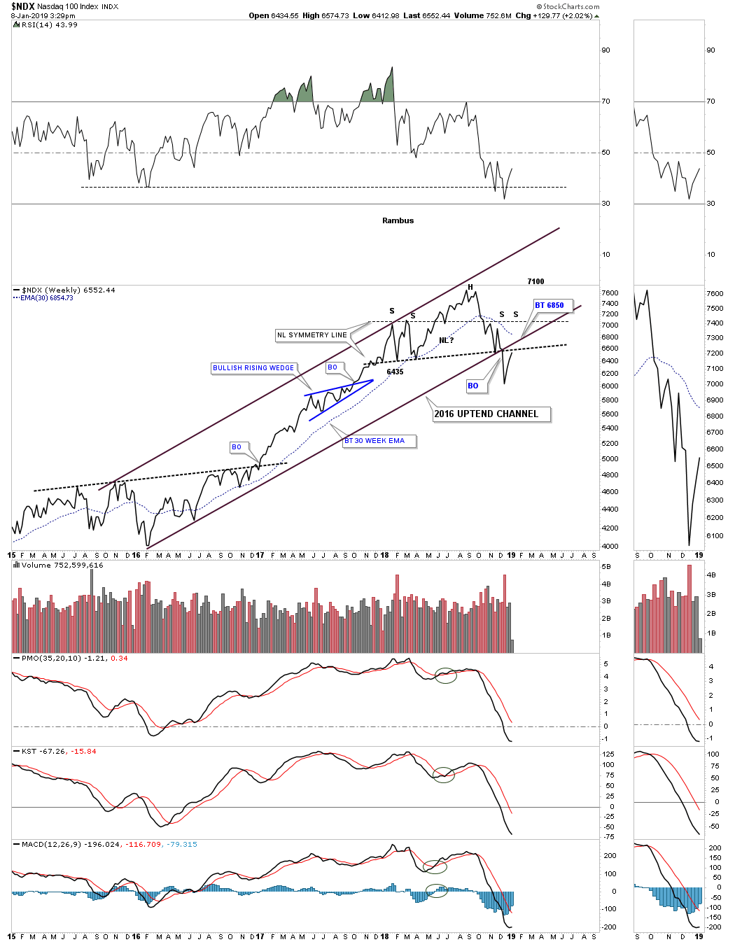
Below is a weekly chart for the NDX 100 big cap tech stocks index which now is at the important backtest area. There is the double neckline with the bottom rail of the 2016 uptrend channel that comes into play around the 6650 area, red circle. The 30 week ema is rolling over and is currently at 6854. The moment of truth has arrived for the NDX which is close at hand.
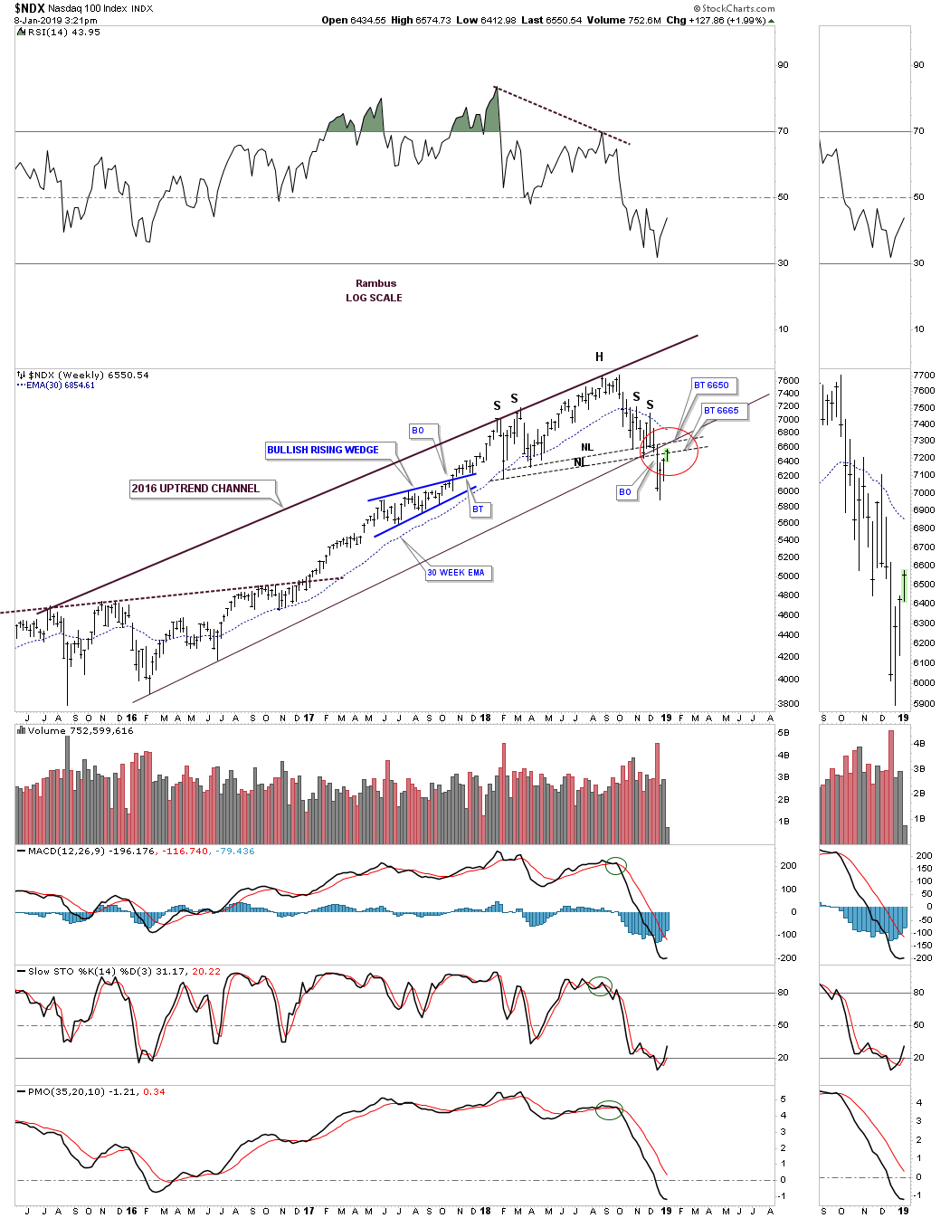
This weekly line chart for the NDX gives us a slightly different perspective with the H&S neckline just above the current price action with the most important area on the chart is the backtest to the bottom rail of the 2016 uptrend channel that comes into play at the 6850 area.
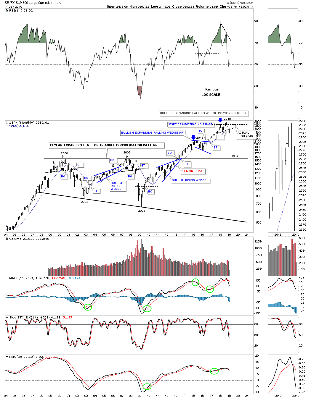
Below is a daily chart for the SPX which shows the A B C countertrend rally up to the 2620 area that coincides with the neckline and the 50 day ema. I don’t show it on this chart but the fib 50% retracement of the last move down from the very top to the bottom comes into play around the 2644 area.
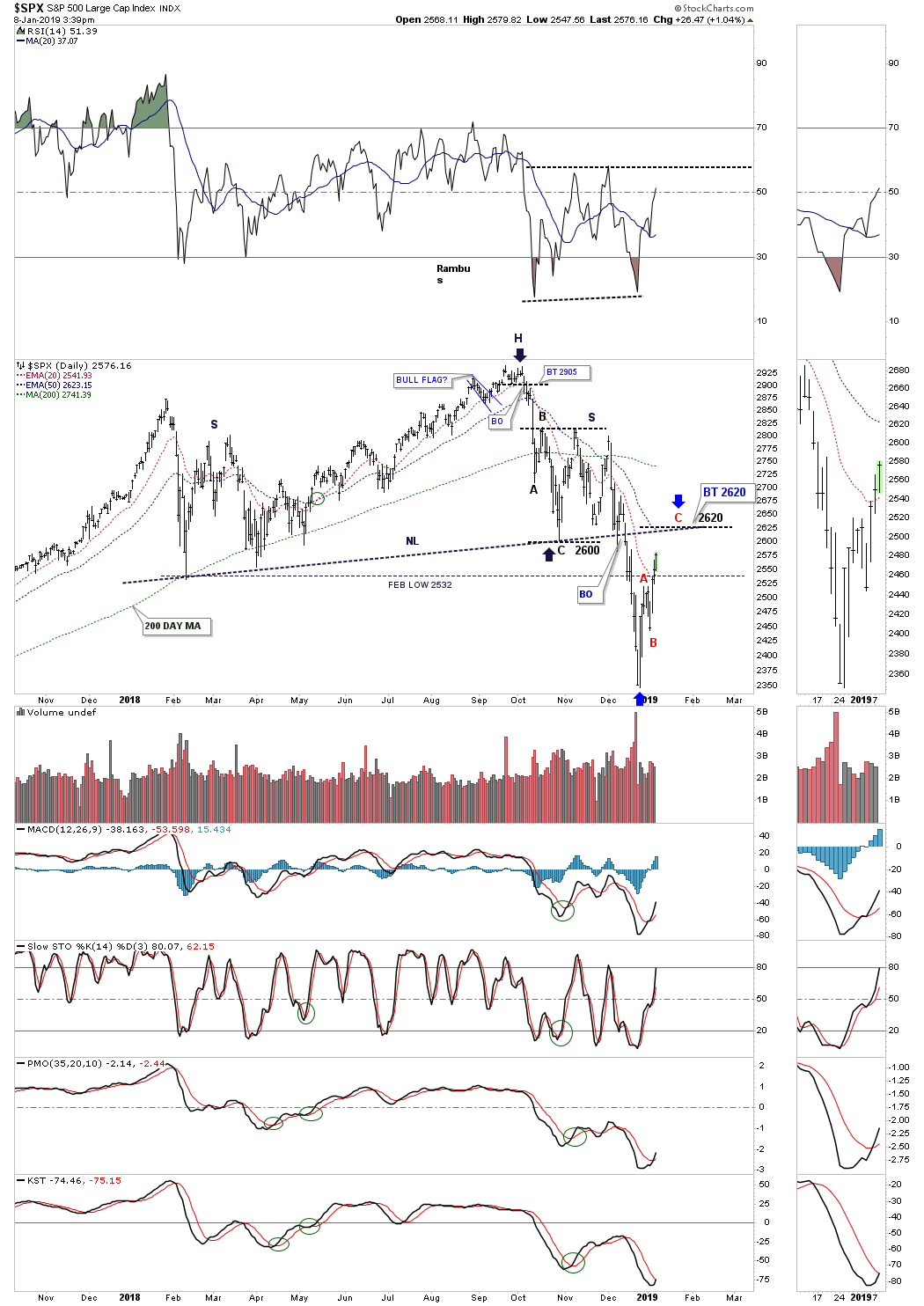
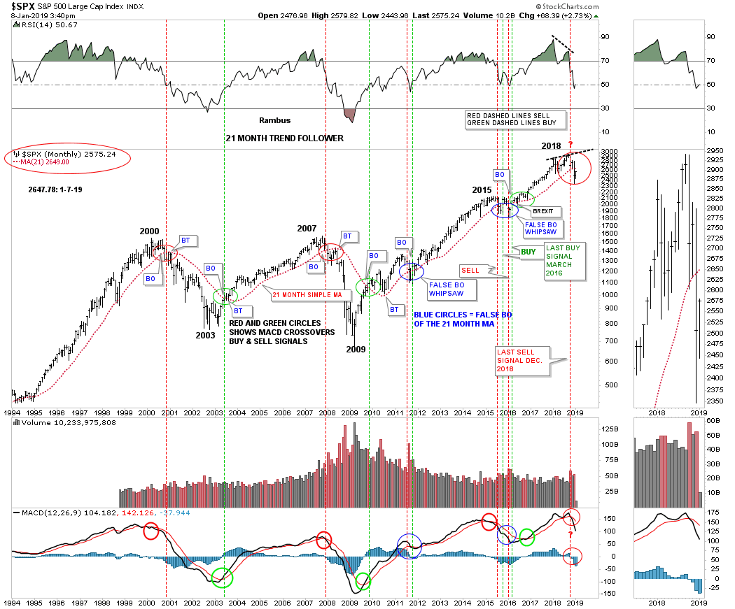
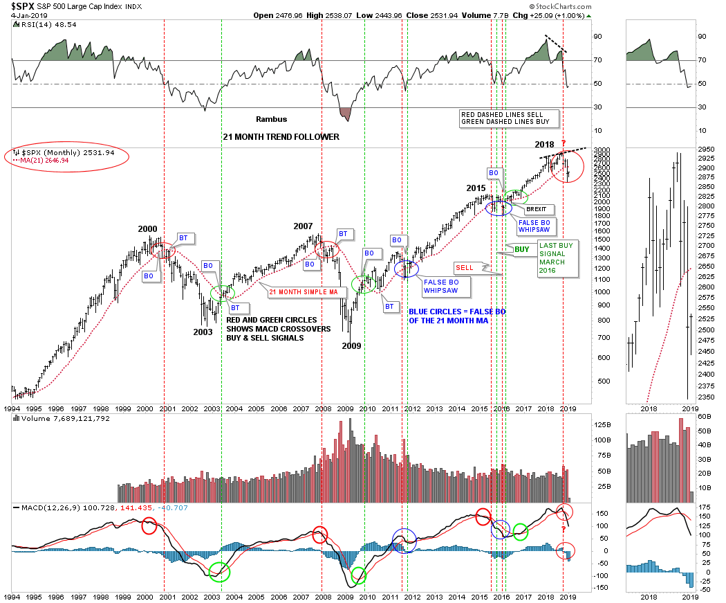
And then we have the 21 month sma chart which shows the 21 month sma now at 2649 that needs to hold resistance going into the end of the month which is still a long ways away.
……..
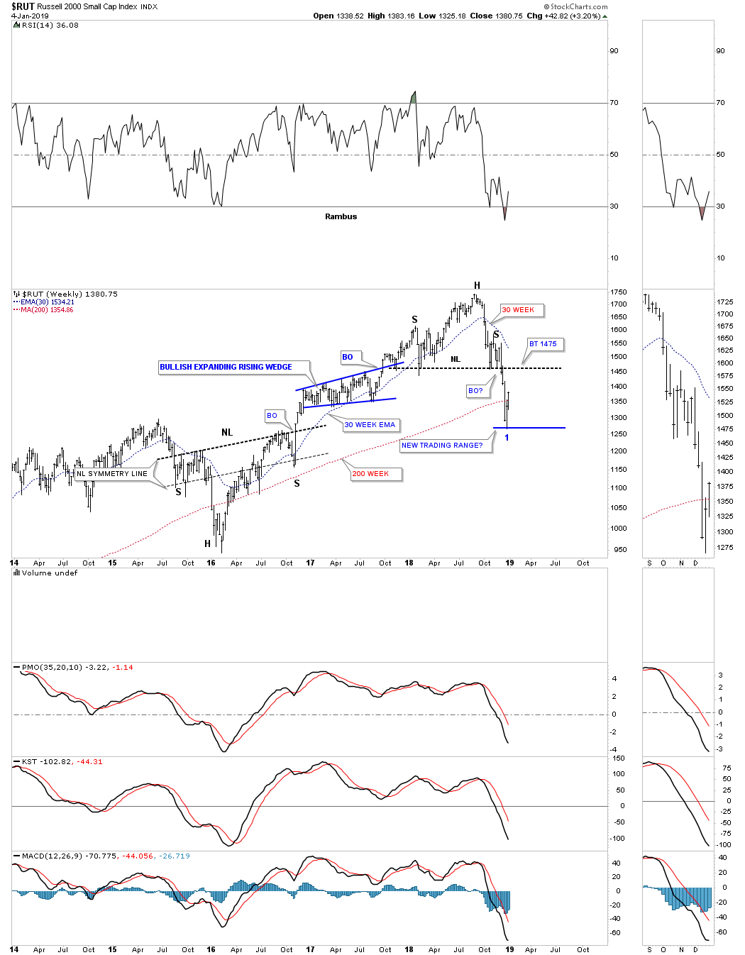
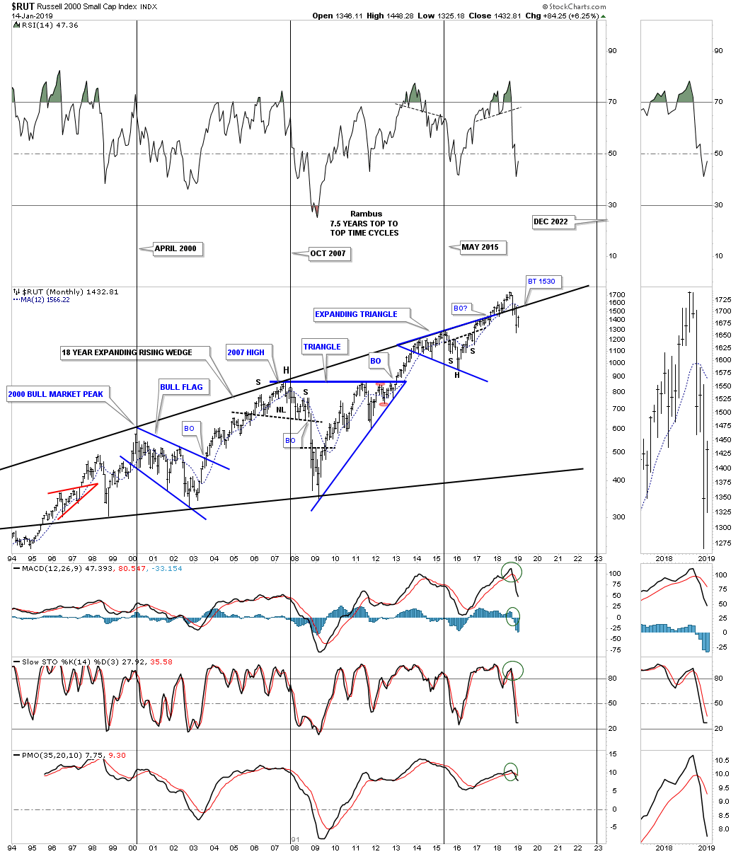
Tonight I would like to show you some charts for the US stock markets so you can understand the Chartology of what has happened over the last year. I’m going to start with a five year weekly chart for the $RUT which paints a good picture of where the small caps were and where we are now in the intermediate term.
First lets look at the 2016 H&S bottom which led to the two year impulse leg up that was unrelenting except for the blue bullish expanding rising wedge halfway pattern. That consolidation pattern began to form in early December 2016 and didn’t end until the end of September of 2017. That is a lot of chopping action that tested ones patience with eight reversal points before it was completed.
The initial breakout from the H&S bottom lasted only five weeks before the bullish expanding rising wedge began to form. Knowing that the price action had just built out a fairly large H&S bottom gave me the confidence to stay with the game plan of being long two positions in many different areas of the markets using the 30 week ema for my sell/stop. Now we are facing a similar situation with our current H&S top that gave way on December 3rd exactly one month ago.
The initial breakout move below the neckline has taken about three weeks to reach what looks like the first low in which we will either see a complete backtest to the neckline around the 1450 to 1475 area or we will see some type of consolidation pattern start to building out with the first reversal point at last weeks low. What we have just experienced is the breakout move out of the almost one year H&S top. This is the type of price action one wants to see on a breakout move, hard and fast. We now have a very clear line in the sand with the 2018 H&S neckline. Note how the price action made a series of higher lows from the 2016 bottom all the way up to the H&S top in 2018. Since the head was formed back in August you can see a series of lower lows which is a downtrend that looks completely opposite to the 2016 – 2018 bull move.
Next lets look at a daily chart for the $SPX which is showing us a H&S top with the price action breaking below the neckline two weeks ago. After such a big breakout move it’s either time to buildout a consolidation pattern or a complete a backtest to the neckline. The 2620 area looks like an important area on this daily chart for several reasons. First it’s where the neckline comes into play. Next the 50 day ema also is close to the neckline currently at 2628. If we get the red A B C correction to the upside it will come in at 2620, blue arrows. The black arrows measures the A B C move down from the head which called for 2600 with the A and C legs being the equal.
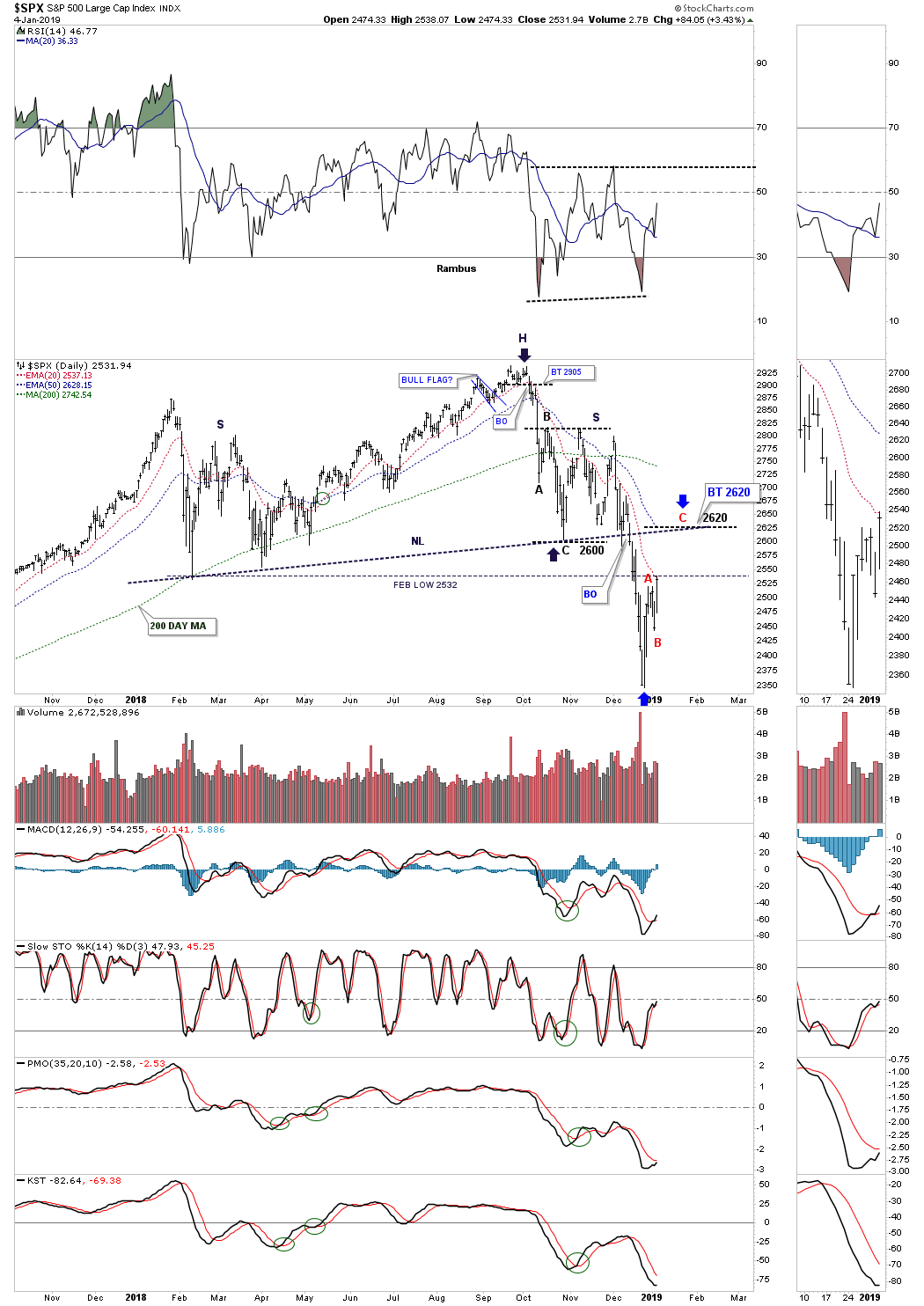
Another reason the 2620 area would be a good place to look for resistance is the 21 month trend follower chart which has the all important. 21 month sma currently at 2647. I moved the red dashed vertical line to the left just a bit so you can see how close the SPX is to the 21 month sma. If you follow how the price action interacts with the 21 month sma going all the way back to 1995 you can see when the SPX either breaks out above or below we always get a backtest. If the SPX trades up close to the 21 month sma I will take my second position just like we did during the 2016 – 2018 ride. If we get a monthly close above the 21 month sma then it will be an automatic sell signal.
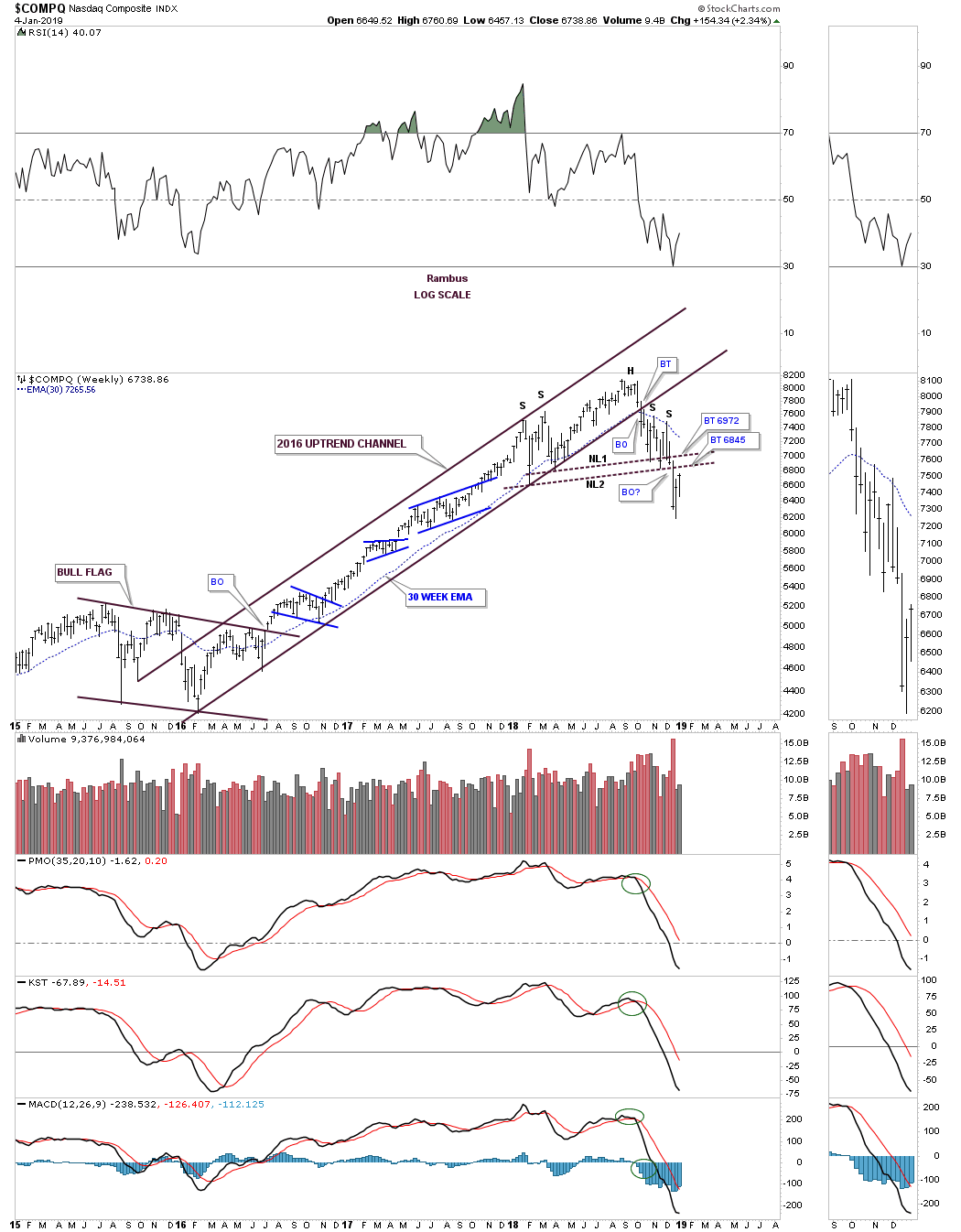
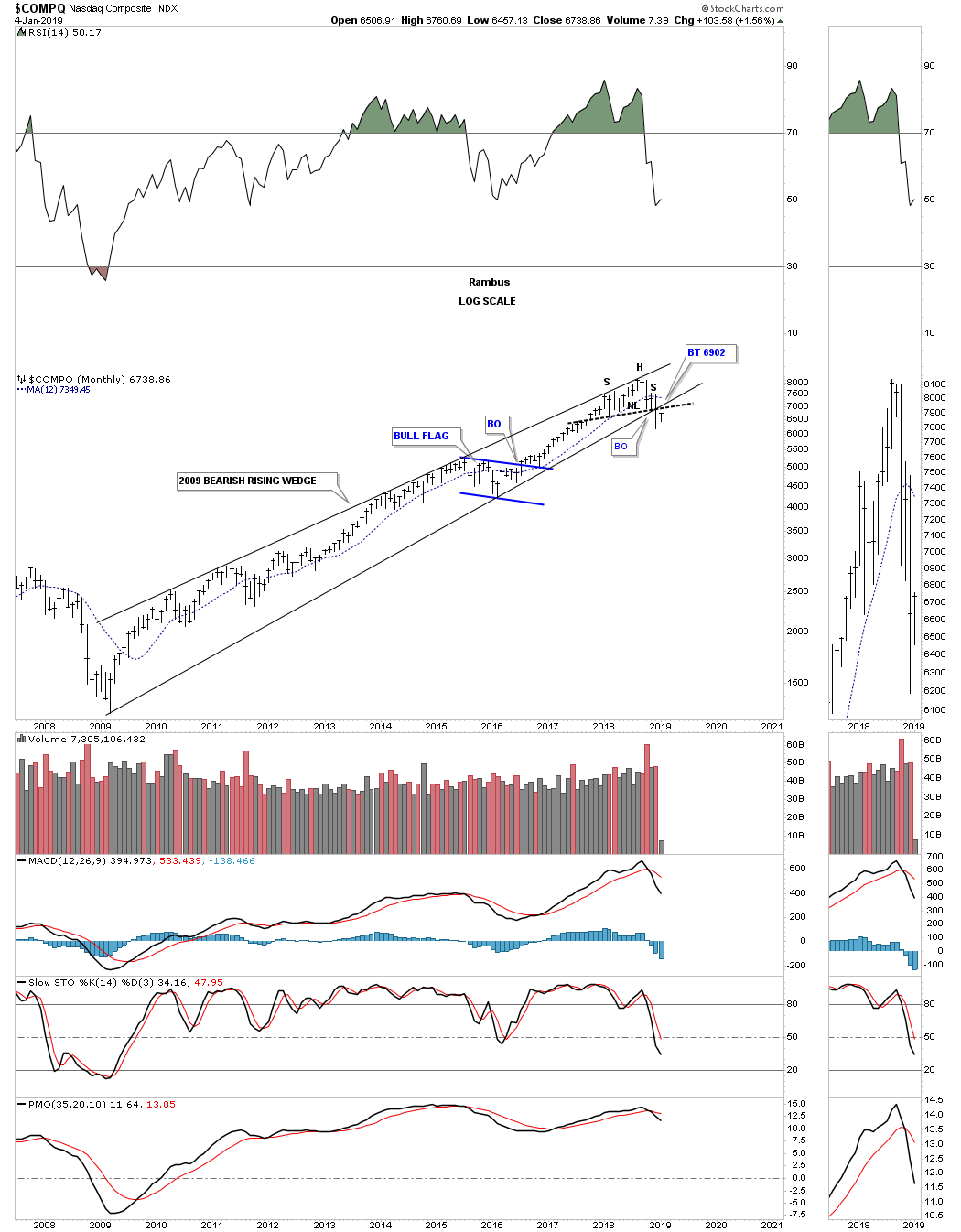
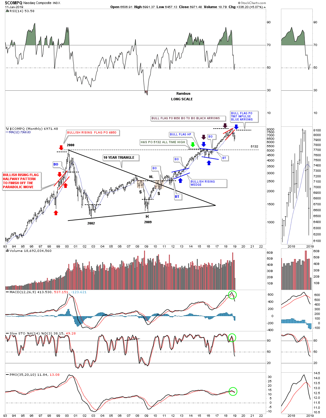
Below is a weekly chart for the $COMPQ which shows the H&S top with the left shoulder and head forming inside the 2016 uptrend channel with the right shoulder high forming on the backtest to the underside of the bottom rail. The 30 week ema is now rolling over to the downside and has been offering resistance on both right shoulders.
This last chart for tonight is a long term monthly look which shows the 2009 bull market as a bearish rising wedge with the H&S top reversing the 2009 bull market. As you can see even the 12 month sma is now pointing lower.
The bottom line is that what we’ve seen over the last month or so is the breaking out process of the one year H&S top. Sometimes you get a complete backtest to the neckline and sometimes you don’t. I’m prepared for a complete backtest and if we don’t get one I will be looking for a place to take my second position which will be a short position. In a bull market the trend is your friend and in a bear market the trend is your friend. It’s much easier to go with the flow than against it. Have a great weekend and all the best…Rambus
……….
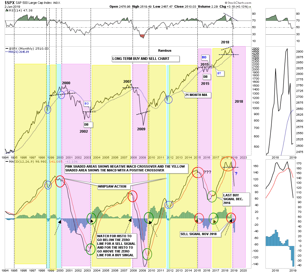
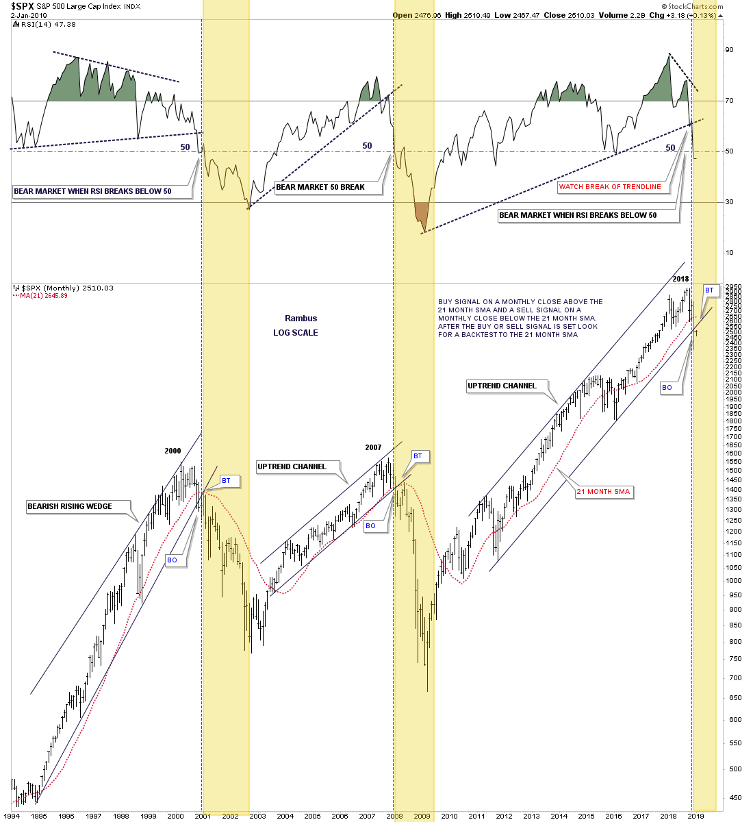
This past Monday marked the end of the month of trading for the SPX so now is a good time to look at the 21 month trend follower chart to see how it closed out the month of December. For the newer members the 21 month simple moving average gives long term buy and sell signals for the SPX. Think of it as a moving trendline, above is bullish and below is bearish with backtest for confirmation.
Lets start on the right side of the chart which shows the SPX closed the month of December below the 21 month sma for the first time since January of 2016 when the SPX was consolidating the previous impulse leg up giving us a sell signal. The last buy signal was given in March of 2016 and ended on December 31st of 2018. Again, for new members just follow the price action on the SPX and how it interacts with the 21 month sma to see the buy and sell signals as shown by the red and green circles. The blue circles shows the whipsaws. Please note that shortly after a buy or sell signal is generated there has always been a backtest to the 21 month sma either on a buy or sell signal. A backtest to the 21 month sma would now come into play around the 2645 area which is roughly 130 points higher from today’s close.
I added five more years to this monthly chart for the SPX which shows how the 21 month sma worked going into the conclusion of the last secular bull market that shows the blowoff phase into the 2000 top. We are now officially on a long term sell signal on the SPX unit we get a monthly close above the 21 month sma. As you can see these buy and sell signals tend to last for years.

This next long therm chart for the SPX shows how the MACD and histogram work for long term buy and sell signals. When the faster black line crosses below the red line on the MACD with the histogram, vertical lines at the bottom of the chart moving below the zero line, you get a sell signal, pink shaded areas with the red circles. A buy signal is given when the black line crosses above the red line with the histo trading back above the zero line as shown by the green circles. As you can see the last sell signal was given at the end of November just over a month ago, red circle. We now have two long term sell signals in play. This is just the fourth long term sell signal given in the last 25 years so the odds are pretty high this sell signal should stick for some time.
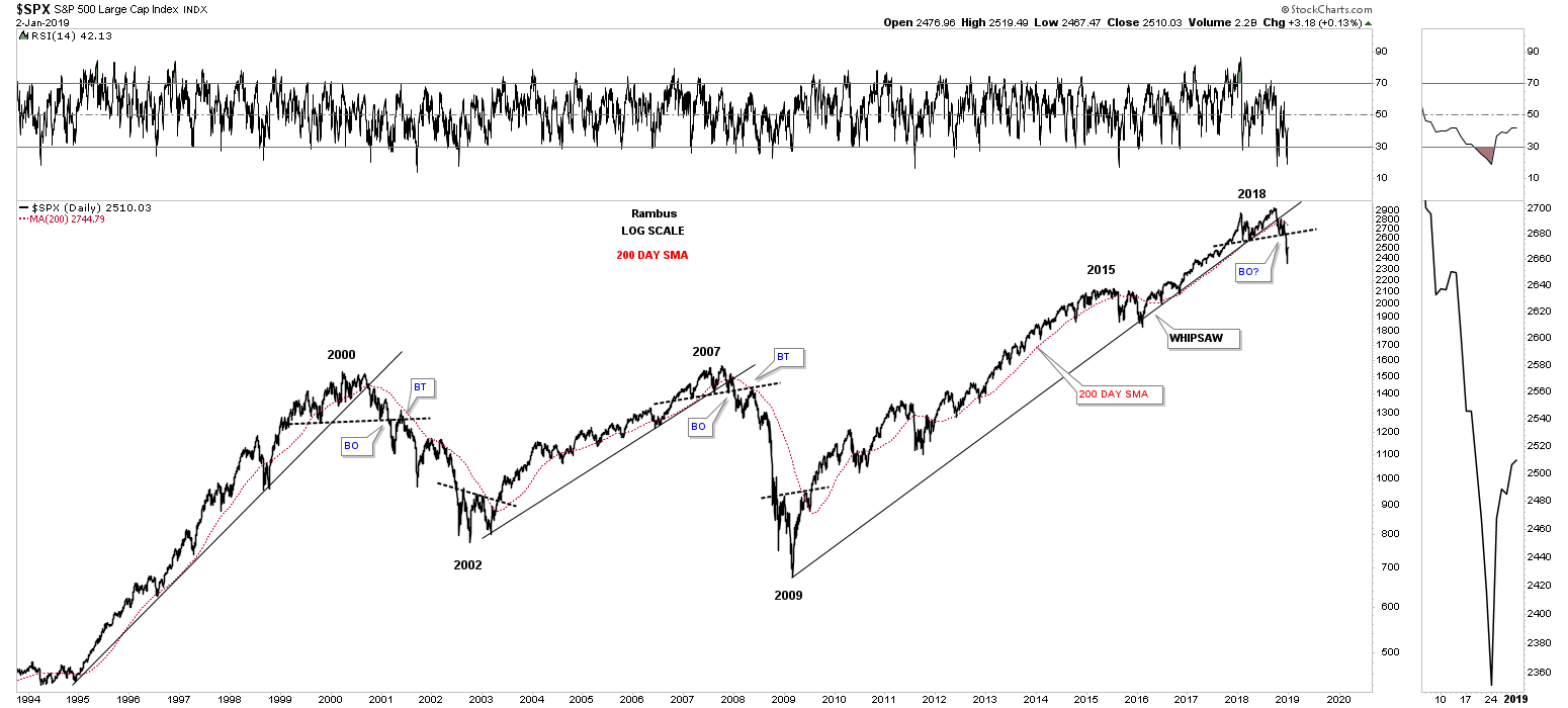
Below is a long term daily chart for the SPX which goes back 25 years and uses the 200 day sma with the bull market trendline. It’s not a clean as the 21 month sma but you can see how the 200 day sma does a good job of holding support until a top is put in place. Normally when you believe you are seeing some type of topping pattern building out the 200 day sma will start rolling over as the top begins to breakdown which is now happening with the 2018 top. The 2015 trading range produced a whipsaw which led to the 2018 top.
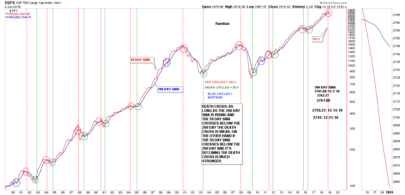
We’ve heard a lot about the recent death cross on the SPX which occurs when the 50 day crosses below the 200 day moving average. Below is a 40 year daily chart for the SPX which shows the bull crosses, green circles and the bearish death crosses, red circles. Back on December 2nd of this year I noticed the 200 day sma starting to flatten out so I began to track the 200 day sma which was at 2762. On December 31st it was down to 2745 confirming the death cross. Note the thumbnail on the right side of the chart where you can see the death cross with both the 50 and 200 day sma pointing strongly down.
This next long term monthly chart for the SPX uses the RSI, 21 month sma and the bull market uptrend to give sell signals. Normally during a bull market the RSI will usually stay above 50. When you see the RSI 50 give way to the downside that is a strong warning the bull market may be over. This chart ties everything together for our latest sell signal based on the previous two tops, the one in 2000 and the one in 2007.
First note the big negative divergence on the RSI vs the SPX when it topped out in 2000. When the RSI failed to hold 50 the bottom trendline on the 2000 bearish rising wedge gave way signaling the bull market was over. After a backtest to the bottom rail of the rising wedge and the 21 month sma all the work was completed and the bear market began. Note how similar the break below the RSI 50 led to the breakout below of the rising channel into the 2007 high, with the backtest to the underside up the bottom rail, and the 21 month sma before all the work was done and the bear market began.
Now it’s time to look at our current 2018 high which shows the SPX breaking below the RSI 50 which has led to the breakout below the bottom rail of the uptrend channel and the 21 month sma. The only thing that is lacking is a complete backtest to the underside of the bottom rail which is very close and the 21 month sma. Also more confirmation will be when we see the 21 month sma roll over to the downside which never happened during the 2015 correction. You can also see the big negative divergence on the RSI during the topping process in 2018.
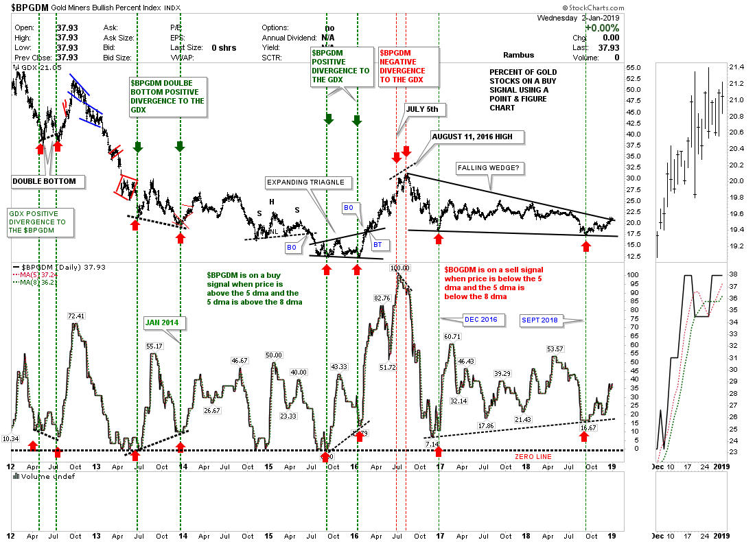
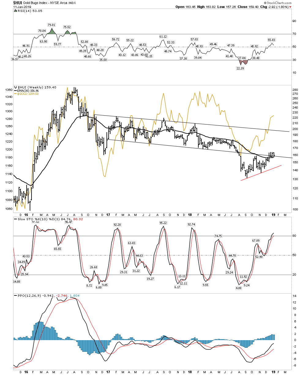
Lets change it up a bit and look at the $BPGDM, gold miners bullish percent index, which just went on another buy signal. As you can see on the sidebar the $BPGDM is now higher than the 5 day sma and the 5 day sma is higher than the 8 day sma. We still have that big positive divergence from the 2017 low to the most recent low in October of this year. You can also see how the GDX keeps hitting the top rail of its 2016 falling wedge. There are four completed reversal points so a breakout above the top rail could happen at anytime initiating the next impulse leg up.
I would like to update the long term chart for the $HUI which shows its entire history for some of our newer members that might not have seen this chart. This chart shows every pattern that has built out over the life of the HUI and shows how a bull and bear markets are supposed to look. During a bull market you want to see one consolidation pattern forming on top of the previous one until a top is put in place, with each consolidation pattern having a minimum of four reversal points. A bear market will have consolidation patterns that will also have a minimum of four reversal points. A reversal pattern will have an odd number of reversal points.
Back is September of this year the price action came very close to reaching the bottom rail of the HUI’s bull market uptrend channel but fell just shy of the 120 area I was looking for.
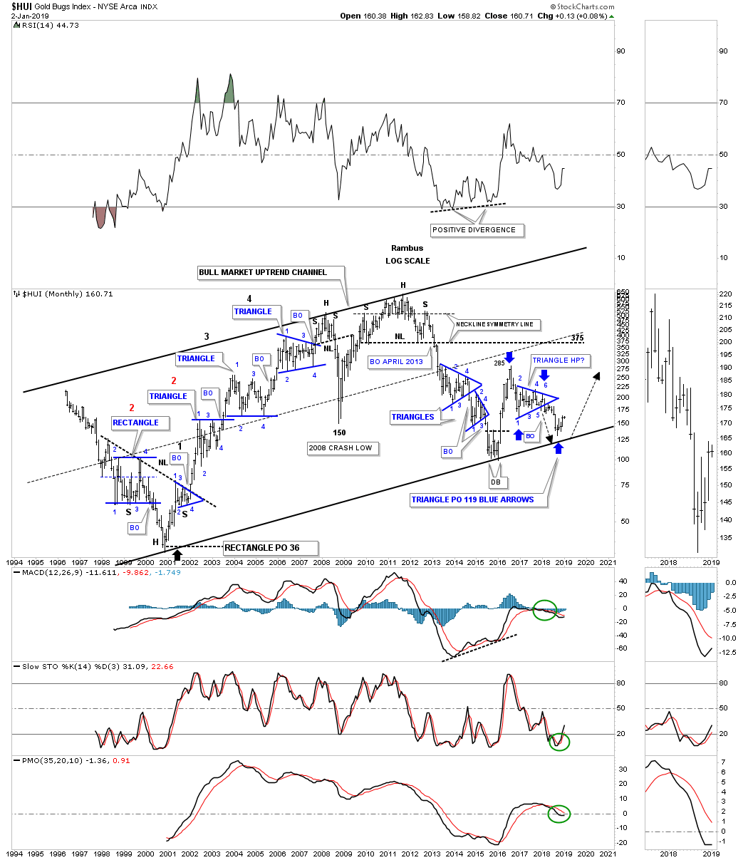
Below is the exact same chart as the one above but his chart is a line chart which gives us a slightly different perspective. First you can see the blue falling wedge that is currently building out and is the same falling wedge we look at each day on the weekly PM combo chart. This line chart also shows the double top that formed just below the top rail of the major uptrend channel and our current double bottom which is forming on the bottom rail of the uptrend channel. The black rectangles show us we have a perfect parallel uptrend channel in place. Our major line in the sand is the bottom rail of the major uptrend channel, below is bearish and above is bullish. Time to get this posted. All the best and Happy New Years…Rambus

4th Quarter Gold Recap
This is a recap of Rambus Gold posts for The Solari Report
In this Weekend Report I’m going to update some gold charts we looked at several months ago in November of 2018. At that time gold was trying to put in some type of bottom but is was unclear yet what or if a bottoming pattern was really developing.
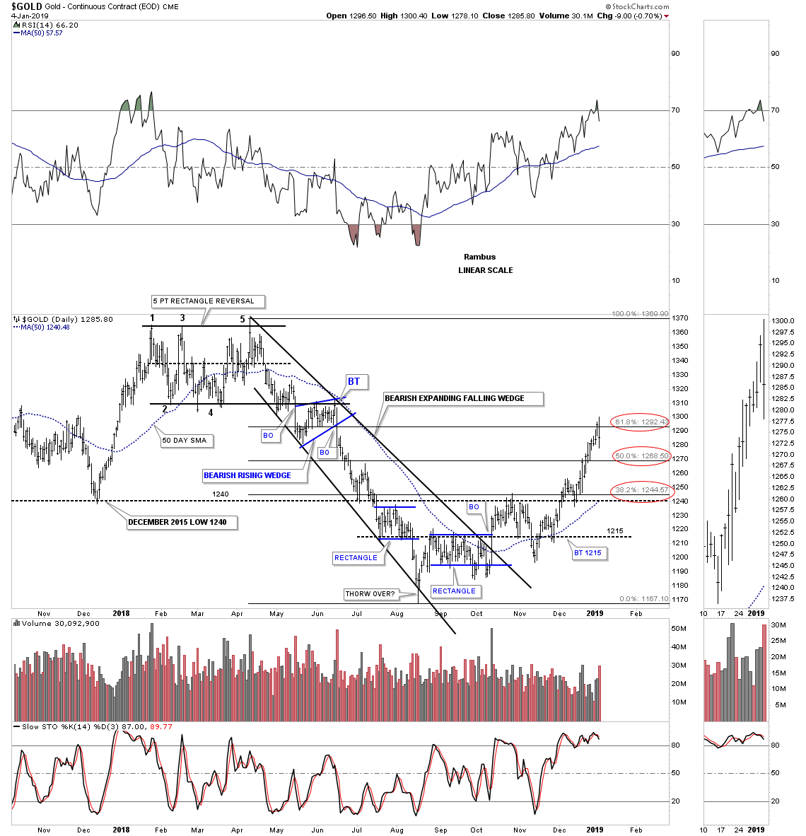
This first chart is a daily look at gold that was showing some bottoming action with a possible double bottom forming. We got the breakout above the double bottom hump and gold ran up to the 1240 area which was the next area of potential resistance. At that point gold had a fairly hard decline back below the double bottom hump trendline which at the time was 1215. At that point it looked like a possible failure when the price action broke below 1215 but once gold rallied back above that important 1215 double bottom trendline we could label the false breakout as a bear trap, red circle. After the false breakout was confirmed there was one last backtest to the 1215 double bottom trendline before gold started to rise.
At the time I suggested we could see a ping pong move between 1240 and then next area of resistance which was 1265. Gold didn’t make it all the way up to the 1265 area before it backtested the 1240 S&R line that held support and led to the most recent rally up to our current high that hit 1300 last week. The 1310 area represents the bottom of the five point rectangle reversal pattern that formed earlier this year. I added a brown shaded S&R zone which is an area we could find support if we get some backing and filling. The blue arrows show how I was looking for some reverse symmetry to the upside vs how the price action came down over that same area.

This next daily chart shows the fib retracement levels we were looking at with the 61.8% retrace from the top of the five point rectangle reversal pattern to the August low getting tested last week.
Below is the third daily chart we were looking at which was showing a rising flag formation off the August low. The key now will be to see if the top rail can hold support on a backtest. As you can see gold is running right into overhead resistance with all the lows that formed earlier this year. If gold is entering a new bull market it will have to find a way to trade above overhead resistance which may take some chopping action to finally eat through resistance.

There is a big pattern on the weekly gold chart we’ve been following along with a million other gold investors and that is the potential H&S bottom that has been forming since the middle of 2013. One year ago this month gold was testing the potential golden neckline but failed to breakout. This is where the five point rectangle reversal pattern formed that we just looked at on the daily charts above. Here we are again one year later with the neckline overhead around the 1365 area.
At this point in time this possible massive H&S bottom is the only pattern I see that can lead the PM complex on another bull market similar to what we saw between 2000 and 2011. As I said last year at this time, the potential is there but the bulls have to show us they mean business and takeout the neckline around the 1365 area in no uncertain terms. There is also nothing in this chart that says our current rally out of the August low can’t be the rally that takes gold above its neckline.

I always like to look at the line charts as they often times can signal a breakout before a bar chart does. Looking at this weekly line chart for the potential H&S bottom we can see the golden neckline comes into play around the 1345 area on a weekly closing basis.

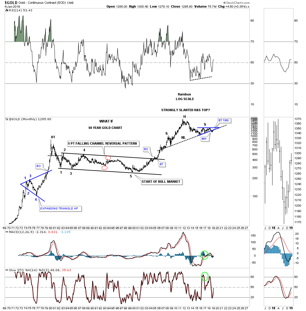
Below is a long term15 year monthly chart for gold which gives the potential H&S some perspective. It is actually forming below the 2011 high, but when you look at the long term charts we can call the H&S a consolidation pattern if it ends up being a halfway pattern to the upside in gold’s bull market that started back in 2001.
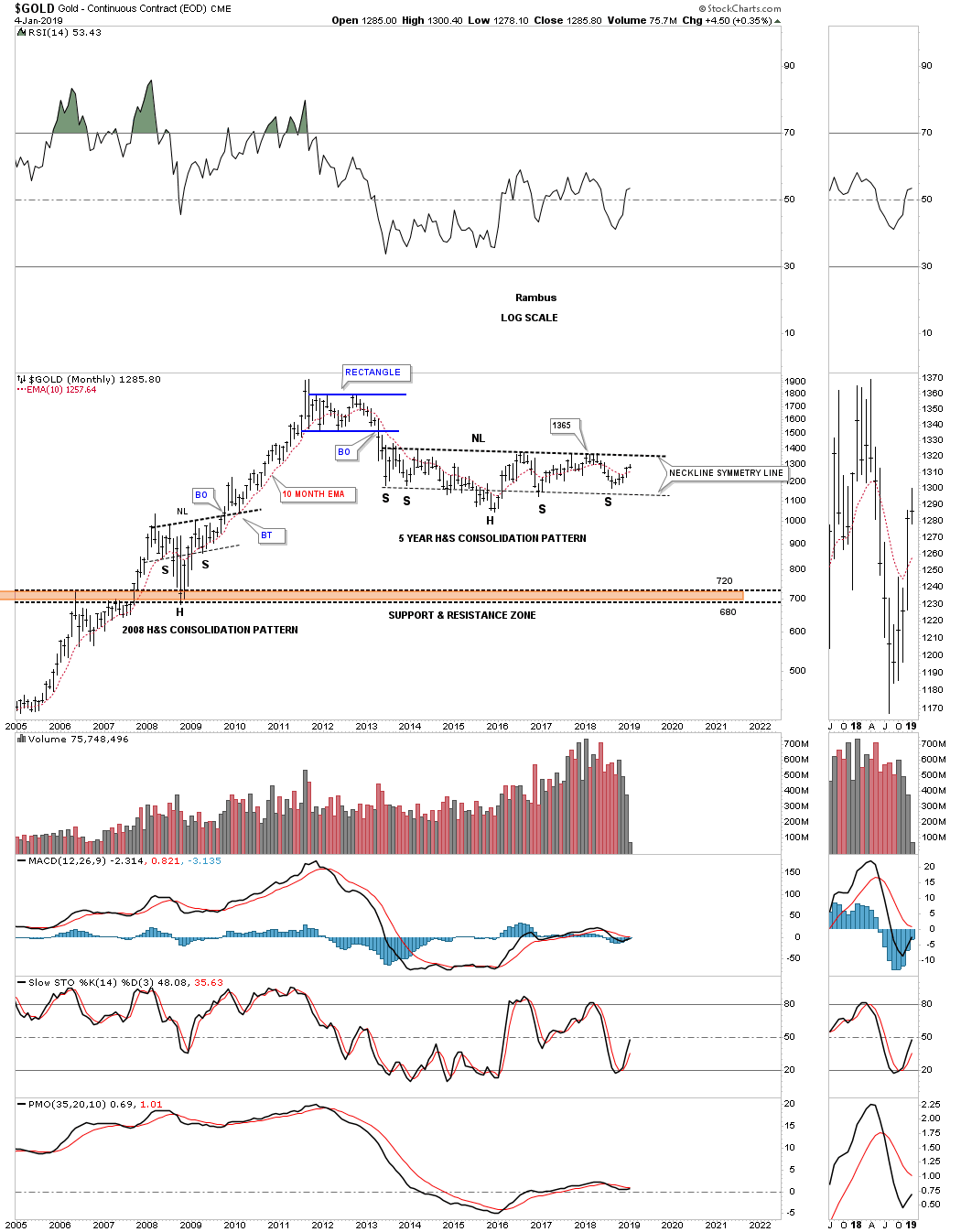
This 25 year monthly chart for gold really puts the potential H&S consolidation pattern in perspective. If the potential right shoulder holds support, I’ve added a top and bottom trendline to show you how the possible bull market uptrend channel may look over time. Keep in mind this chart doesn’t mean anything if the gold investors can’t take out the neckline. The Chartology is there for a continuation of the secular bull market if the bulls can take charge.
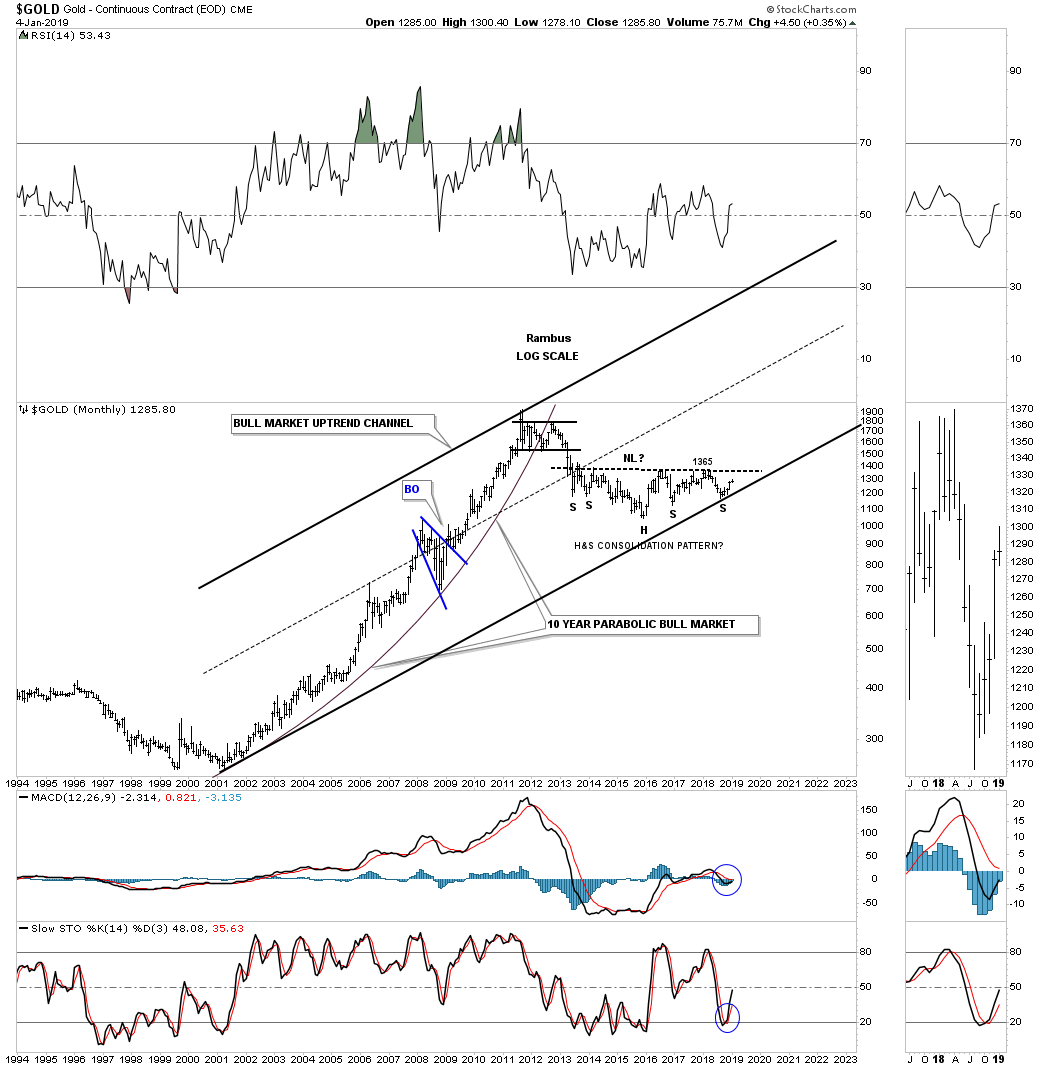
There is always the bearish setup it seems. Below is a weekly chart for gold which shows its 2011 bear market downtrend channel with the 2016 triangle consolidation pattern. What this chart shows is the confluence of three important resistance points which all come together at 1300. First we have the bottom rail of the 2016 triangle. Next the thin dashed back horizontal line that is the bottom rail of the 5 point rectangle we looked at on the daily charts above. Then the all important top rail of the 2011 bear market downtrend channel as shown by the red circle. I kept the lines thin so you can see more clearly how these three trendlines intersect at 1300 which was last weeks high.
Keep in mind we should see an initial reaction down where the three trendlines intersect at 1300. What we want to see is a shallow move lower and then a strong move up and through the 1300 area that leaves no doubt the bulls are back in charge. The top rail of the 2016 triangle is also the neckline of the possible 2013 H&S consolidation pattern we just looked at. To say this is a critical inflection point is an understatement.

Then there is this long term chart we’ve been following for years which shows the potential massive H&S top with the possible neckline stretching all the way back from the 2008 low to the 2018 low. The neckline was slightly broken back in August of this year but then came the small red rising flag formation we looked at on the daily chart above for gold that had five reversal points technically creating a reversal pattern to the upside. On this chart it’s in red. A run around the apex would do a lot of damage to this chart and would be a very bullish development.
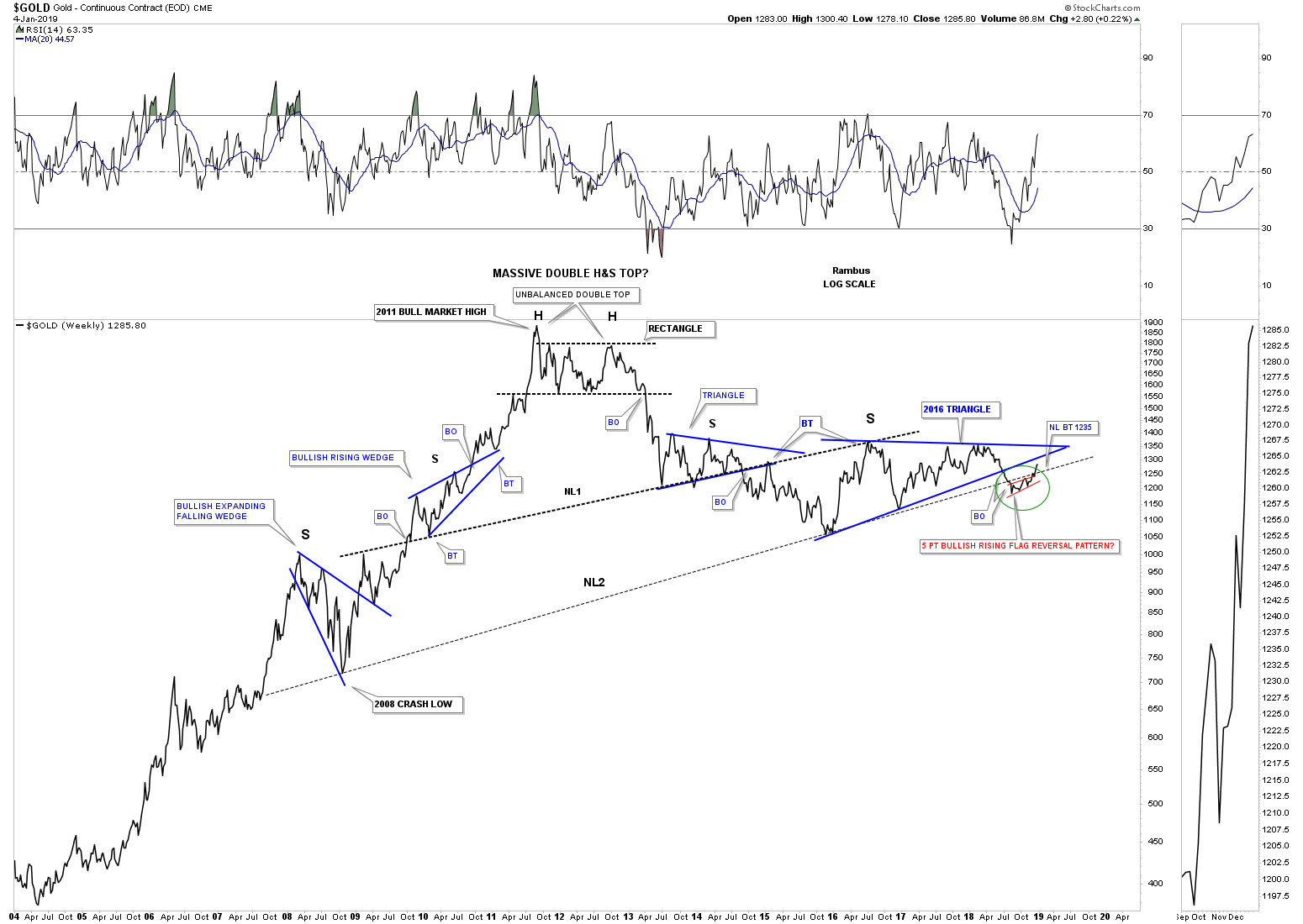
Again, a run around the apex of the blue triangle would do wonders to negate that massive H&S top.
Next lets look at a ratio chart which compares gold to the US dollar. This ratio topped out in 2011 and has declined all the way down to the 2015 low and has been rising in a channel that just hit the neckline extension line last week halting its advance for now. Many times when a reversal pattern is showing strength the price action will trade above where the 5th reversal point should be as you can see on this chart. The price action still has to take out the top rail in order to complete the reversal pattern.
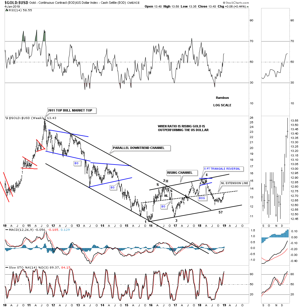
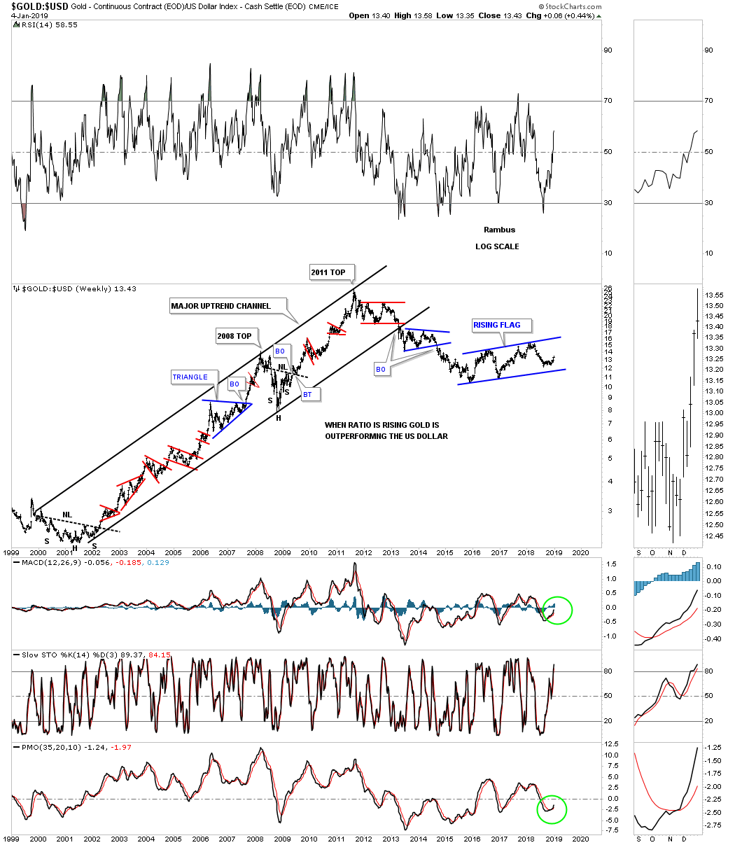
Below is a long term chart for the gold:usd ratio which shows how well gold outperformed the US dollar during gold’s 2000 bull market.
Just a quick update on the weekly ratio chart for the Gold:CRB index which shows the price action just breaking out from its 2015 triangle consolidation pattern and is now in backtest mode to the top rail.
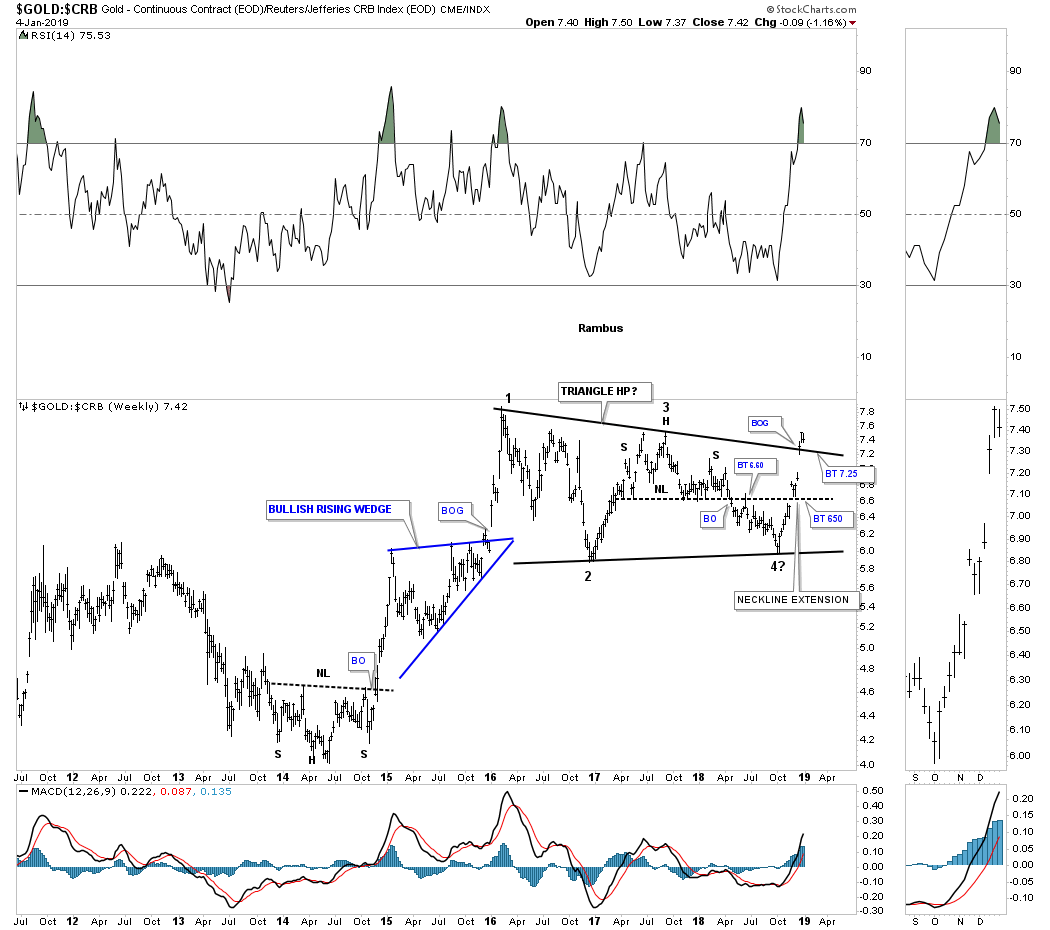
Below is a 50 year chart for the Gold:CRB index we’ve been following for a very long time with the dominate chart pattern being the 25 year bullish falling wedge halfway pattern. I had thought when the ratio hit the top rail of the 2008 expanding rising wedge that the move was over. As you can see the price action started to decline but then began to form the red triangle which is the same triangle on the weekly chart above that has just broken out. The top rail of the blue expanding rising wedge has many touches on it so we know it’s hot. It would be a bullish sign for gold to see the top rail hit again.

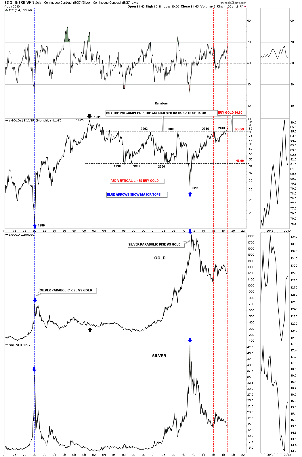
This last chart for tonight is a 45 year ratio combo chart which has the gold:silver ratio chart on top gold in the middle and silver on the bottom. Over time when the ratio trades into the lower 80’s that is generally a good time to buy gold and silver, red vertical lines. This ratio chart also shows when silver goes parabolic, like in 1980 and 2011 against gold, that is a bad sign for the PM complex as shown by the blue vertical lines. If you recall silver was the first to go parabolic in April of 2011 with gold finishing its bull market in September of 2011. The only thing that doesn’t add up is what happened in 1991 when the ratio reached its all time high at 98.25 and nothing happened to gold and silver but a sideways to down trading range. To really kick start a new bull market in the PM complex we need to see the gold:silver ratio start falling which is has started to do recently.
Sorry for the late post. Just not enough hours in the day right now. All the best…Rambus
……………………………….
Tonight I would like to show you a couple of long term charts for Silver that puts where silver is currently trading into perspective. We can look at the hourly charts or even the daily charts for the short term patterns, but if you really want know where a stock is relative to its history we need to look at the long term view. The more history a stock has the more relative the current price action is.
Lets start with a 16 year monthly chart for silver which seems like a long time but in the big picture it only shows us a small part of its history. The dominate chart pattern is the 2011 bear market downtrend channel which is almost perfectly parallel. I purposely left the top rail of the 2011 downtrend channel and the top rail of the 2016 triangle thin so you can see the critical area silver is now trading at, red circle. So far this month silver has traded as high as 15.95 which puts it right against the top rail of the 2011 bear market downtrend channel and the top rail of the 2016 triangle.
I have viewed the 2016 triangle as a halfway pattern to the downside for well over a year or so but with the price action hitting the top rail this month that completed the 5th reversal point which now puts the triangle in the reversal category. I can now take the question mark off of reversal point #5 and add it to the possible reversal point #6. All this means is that we now have 5 reversal points in place to create a reversal pattern if the bulls can punch through the top rail. If they can’t and silver begins to decline all the way down to the bottom rail then a consolidation pattern will be in the picture again. An odd number of reversal points creates a reversal pattern and an even number of reversal points creates a consolidation pattern. The bottom line right now is that we have a triangle reversal pattern in place until it is negated if silver trades backdown to the bottom rail.
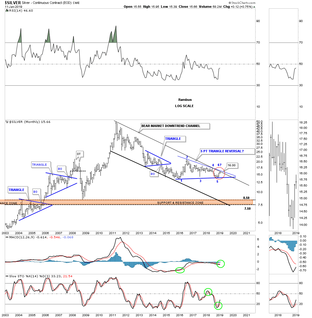
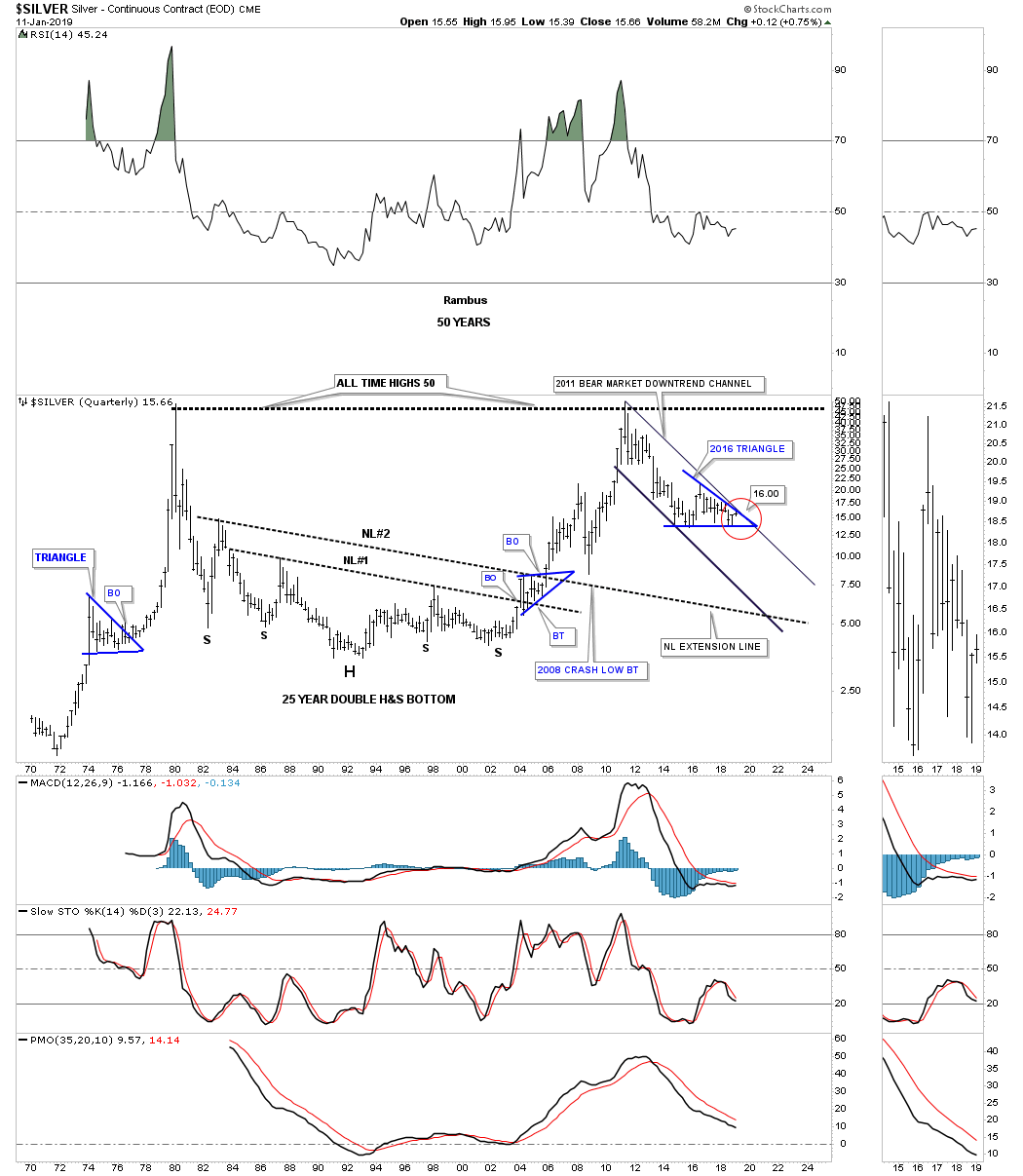
This next chart shows you why the more history a stock has the better perspective one gets when it comes to really big chart patterns. This chart is one of the very first charts I ever posted publicly back in the old days before Goldtent was born. There is a website named Gold Eagle where I posted this chart for the first time which was probably around the 2004 – 2005 timeframe. At the time I showed this massive 25 year H&S bottom that was building out that was showing some nice symmetry. The double neckline looks similar to the double necklines we’v been following on some of the US stock market indexes which I hope will give us the same results as this 25 year double neckline H&S bottom.
Note the blue bullish rising wedge which formed between the two necklines which gave silver the energy it needed to finally break free from 25 years of resistance. Neckline #2 also came in handy during the 2008 crash which gave me a place to look for initial support.
Our 2011 bear market downtrend channel doesn’t look so daunting when compared to the rest of this 50 year chart. As I mentioned earlier when we looked at the monthly chart above for silver that I was looking at the 2016 triangle to be a consolidation pattern to the downside until we just completed the 5th reversal point. As I’ve said so many times during this bear market, it’s now up to the bulls to take out the top rail of the 2011 bear market downtrend channel and the top rail of the 2016 triangle trading range. It is a trading range because neither the upper or lower trendline has been broken. We are close but no cigar just yet.
Sir Plunger will be doing the Weekend Report so stay tuned as his reports are always filled with a lot of history and well thought out objective analysis. Have a great weekend and all the best…Rambus
…………..
After a near vertical rally out of the 2016 January low for the GDX it came tumbling down into its September low in 2018 retracing a big portion of 2016 impulse move up. During the last impulse move down into the September low the GDX formed a gap along the way which I labeled as a halfway gap or an exhaustion gap. With the benefit of hindsight we can see it was a halfway gap to the downside as measured from the breakout point of the black bearish rising wedge to the center of the gap. One takes that measurement and adds it to the center of the gap to get a price objective down to reversal point #3 on the blue diamond.
At that point I began to look for a trading range to start building out which I labeled, Start of New Trading Range, not knowing if it would be a consolidation pattern to the downside or a reversal pattern to the upside, I just knew it was time for a pause to refresh. After chopping sideways for three months the GDX built out the 7 point diamond reversal pattern which formed at the end of the August 2016 decline. The most common reversal pattern is a H&S or double bottom or even a five point triangle, but this seven point diamond which is much rarer, formed the reversal pattern. The breakout above the top rail of the seven point diamond reversal pattern occurred back in early December of 2018 with a breakout gap and a quick two day backtest. So far there isn’t anything on this one year daily chart that suggests the impulse move out of the seven point diamond reversal pattern is failing. It looks more like a small consolidation is forming currently.
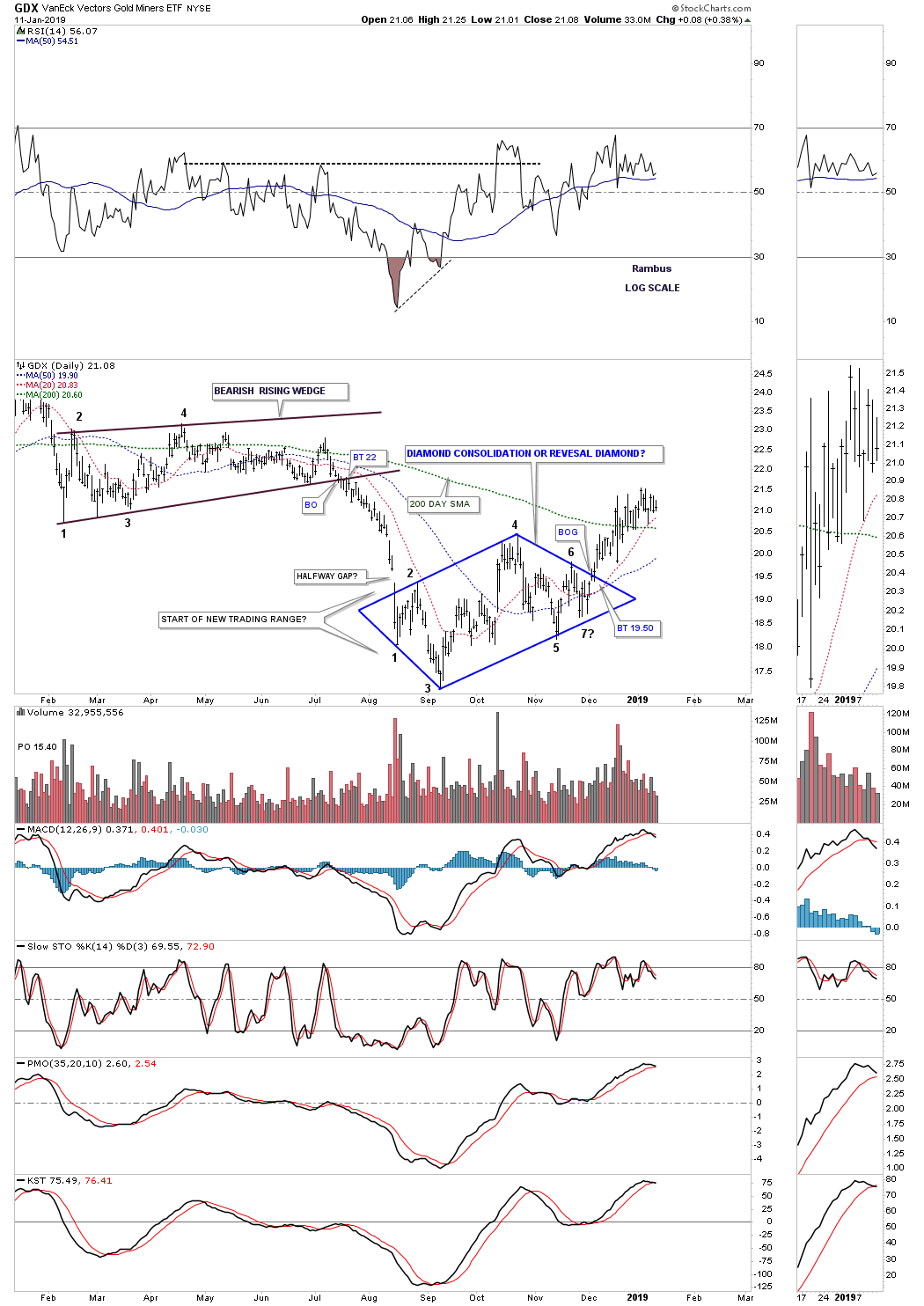
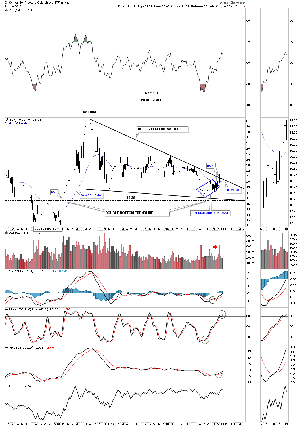
Lets now look at the four year weekly chart which puts the seven point diamond into perspective. First we need to go back to the 2015 double bottom which led to that strong impulse move up into the August 2016 high. Our seven point diamond basically formed on the 2015 double bottom trendline which was the first area to look for initial support, resistance turning into support once broken to the upside.
Once the diamond was confirmed as a reversal pattern I could then drawn in the bottom rail of the 2016 falling wedge. As you can see the price action has now completed it fourth week above the top rail of the 2016 falling wedge as the top rail has been holding support on the backtest. So far this is what you want to see on a breakout of a big trading range, what had been resistance since August of 2016 should now hold as support. The top rail of the falling wedge now gives us a very nice line in the sand, above is bullish and below is bearish. The last point on this chart to make is the nice volume spike four weeks ago on the initial breakout.
Let’s now look at the GDXJ which has produced a combo bottom from its 2016 high. This first daily chart shows a double bottom reversal pattern with the price action breaking above the double bottom hump a couple of weeks ago. It’s now in the process of backtesting the double bottom hump between 29.70 and 30.20 where the 200 day sma also resides.
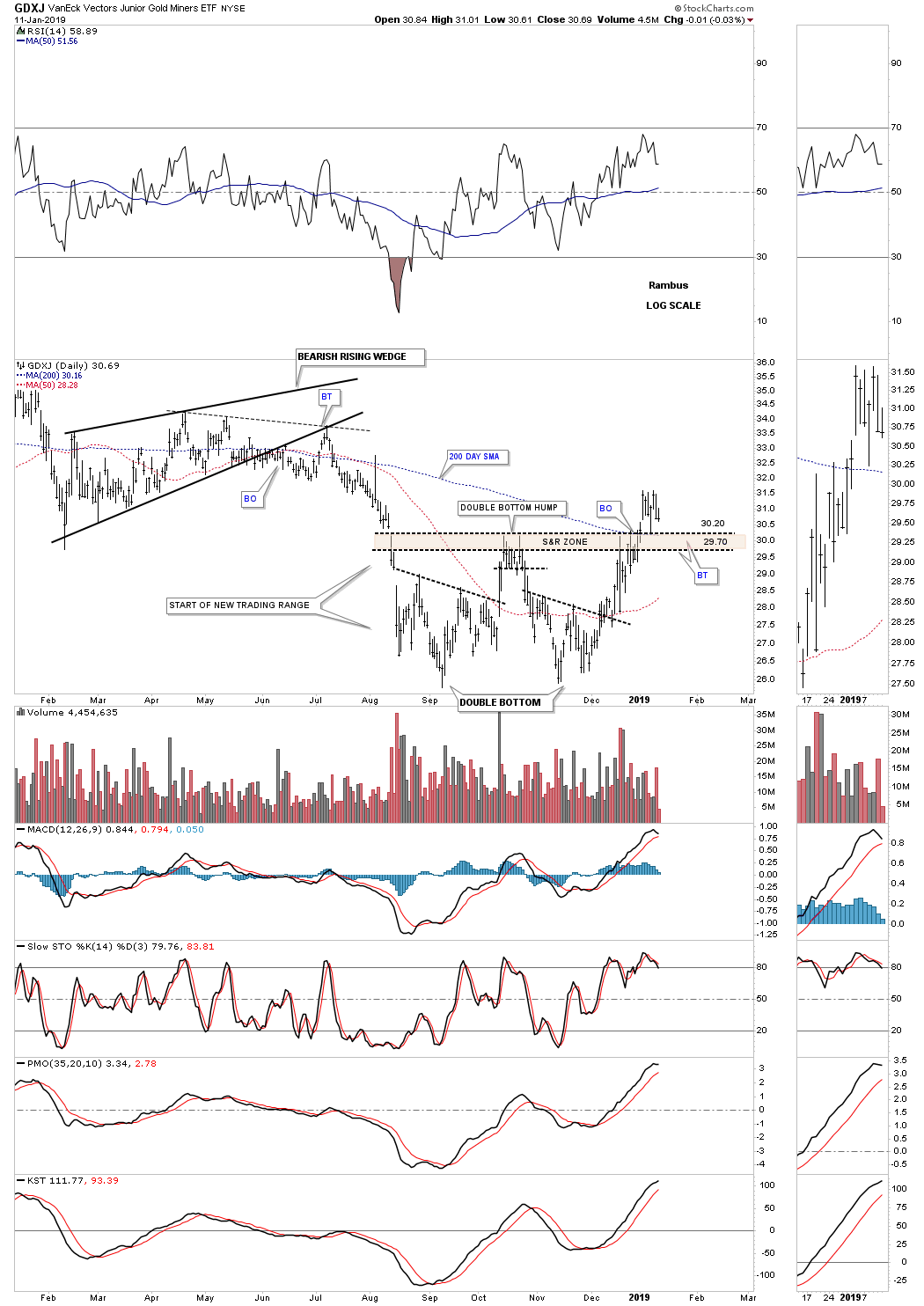
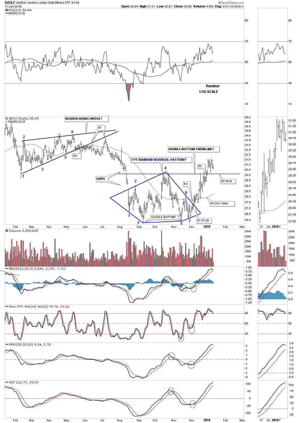
This second daily chart for the GDXJ shows the double bottom as part of the bigger seven point diamond reversal pattern. The top of the diamond is also where the double bottom hump is located at reversal point #4.
Many times in big trading ranges there will be smaller reversal patterns at the reversal points. In the case for the GDXJ this weekly chart shows the double bottom forming at the 4th reversal point within its 2016 falling wedge. It appears the breaking out and backtesting process is underway at the top rail of the 2 1/2 year falling wedge.
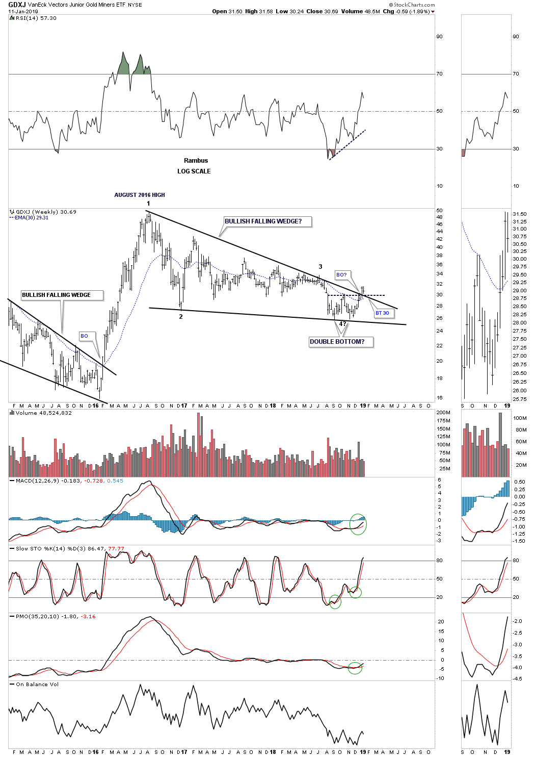
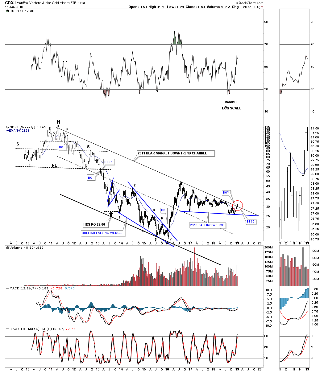
Since the 2011 bear market began for the GDXJ there has been little to get excited about except for the 2016 impulse move. Two weeks ago the GDXJ broke out above the top rail of its 2016 bear market downtrend channel and is in the process of backtesting it from above. This could potentially be the biggest thing to happen to the GDXJ since the bear market started. You can see all the touches the price action has made to the top rail of the 2011 bear market downtrend channel so we know it’s hot and to be respected. Hopefully the bulls have lost respect for that top rail and are now giving it a goodbye kiss. Also keep in mind gold and silver are also testing the top rail of their respective 2011 bear market downtrend channel.
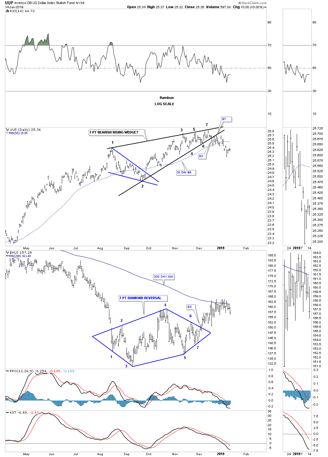
4th Quarter U S Dollar Recap (UUP) & Interest Rates
A couple of weeks ago we looked at this daily chart for a potential new rising channel with the smaller blue rising wedge forming just below the top rail. It now looks pretty obvious that the breakout has occurred below the bottom rail of the blue bearish rising wedge and an impulse move should begin as it looks like the backtesting process is finished. We could fill today’s gap at some point, sooner would be better than later.
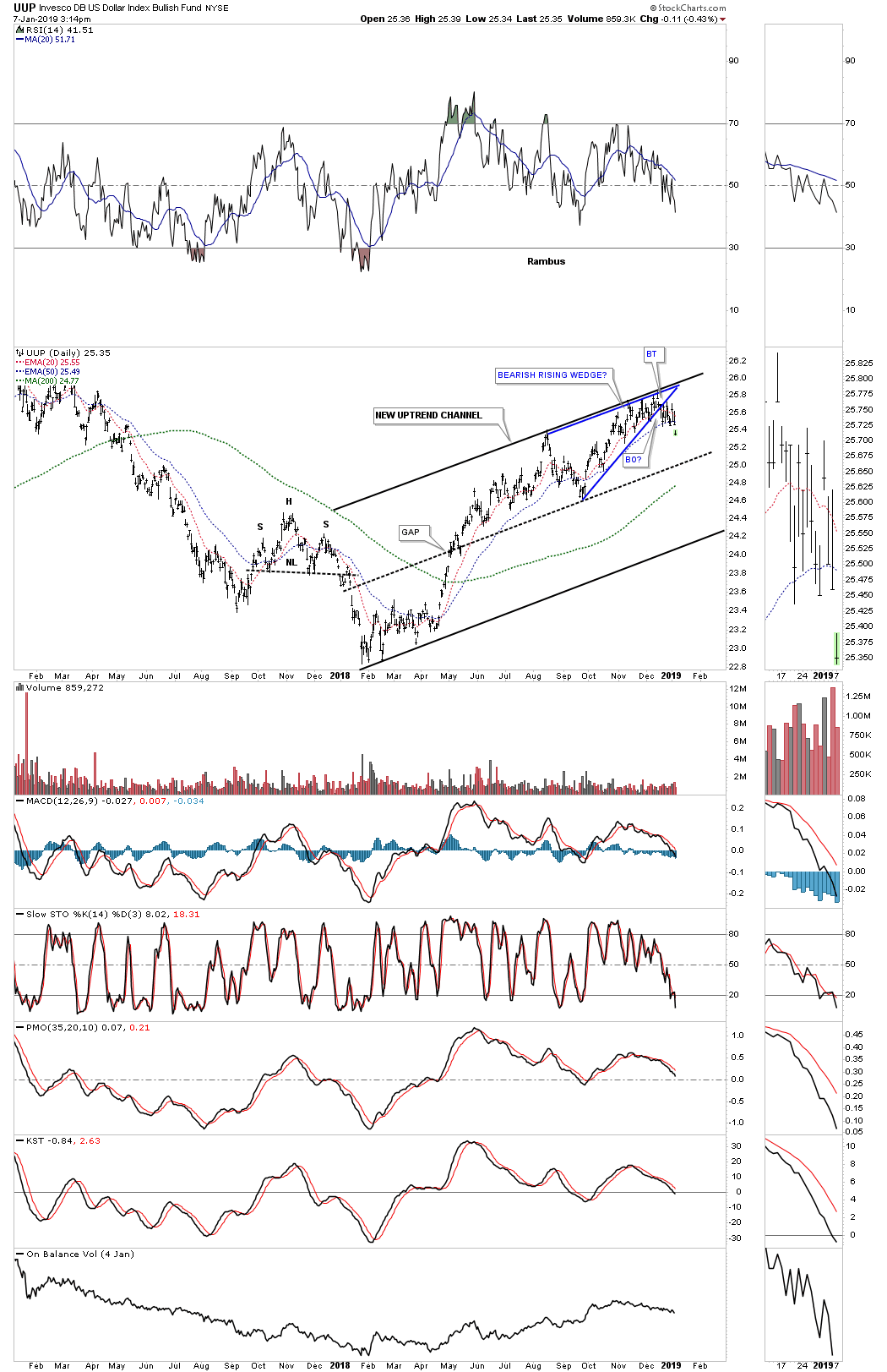
Below is the daily combo chart we’ve been following which has the UUP on top and the HUI on the bottom. One would think this is a bullish development for the PM complex in the short to intermediate term with the bearish rising wedge on the UUP breaking down. Currently the HUI is fighting to trade back above its 200 day sma which will be positive for the PM complex if it can trade through the 200 day sma in a sustained move.
Below is the weekly chart for the UUP.
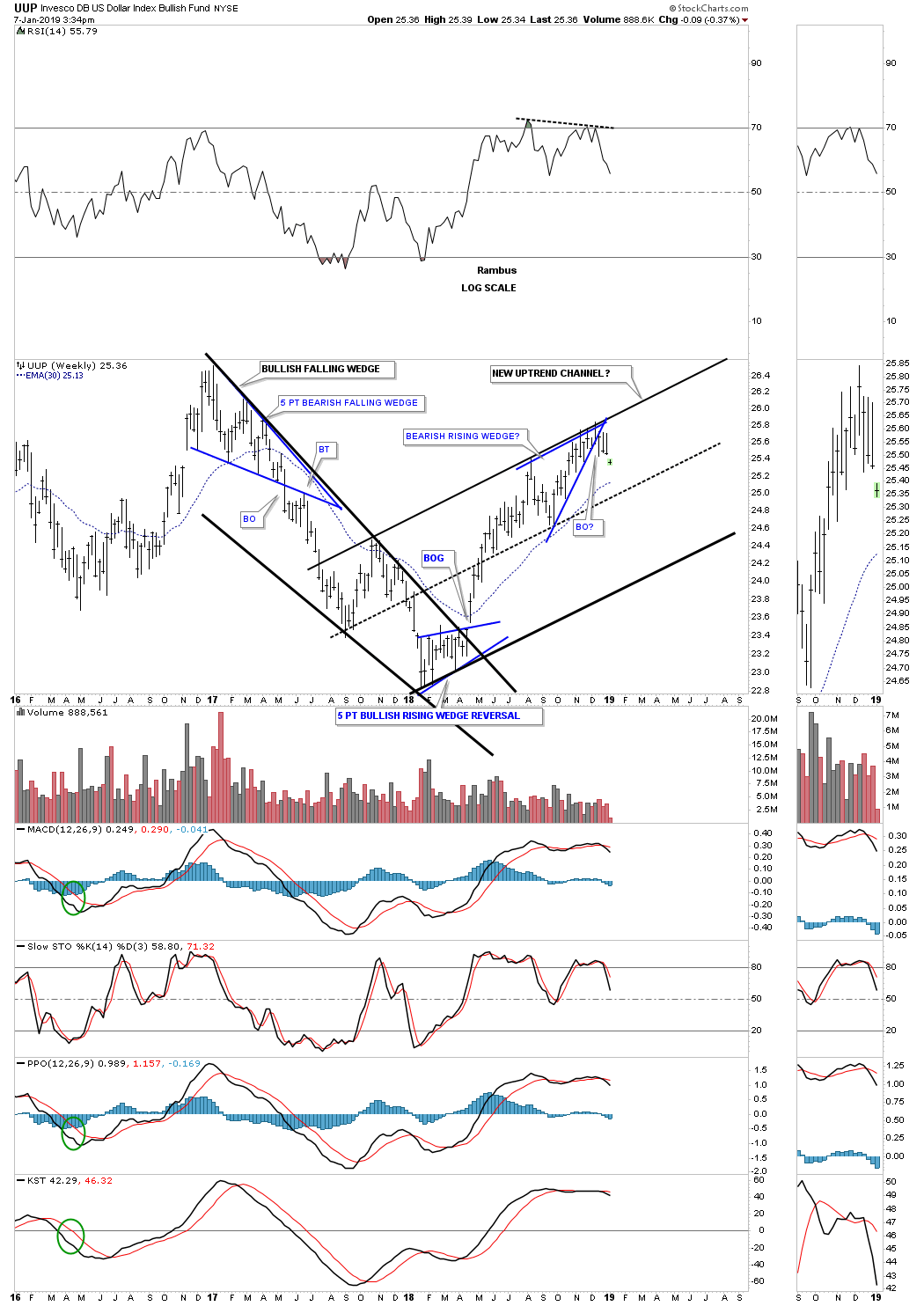
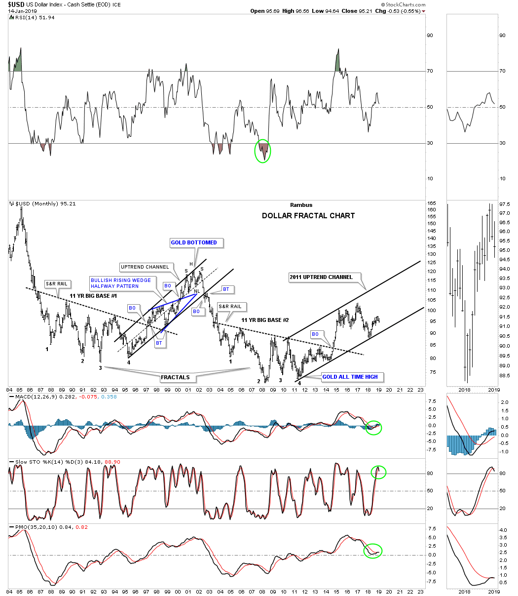
The US dollar has been in an uptrend channel since the 2011 low on this 35 year month chart. The bottom rail of the 2011 uptrend channel appears to be pretty strong as it has three good touches on so far. Since the UUP, which is a proxy for the US dollar, looks a little weak right now it’s possible we could see the bottom rail of the 2011 uptrend channel tested in the intermediate term.
Lets change it up a bit and look at the interest rates sector starting with the 50 year monthly line chart for the $TNX, ten year treasury yield. Since early 2016 the $TNX had been rising into the October of 2018 high where it seems to have run out of gas. As you can see on this 50 year chart the October 2018 high matches the same height as the November 2013 high from five years ago when the ten $TNX rolled over to the downside. For awhile it looked like a possible double bottom was building out, but with the weak price action since the October 2018 high It’s beginning to look more like a bigger trading range is developing.
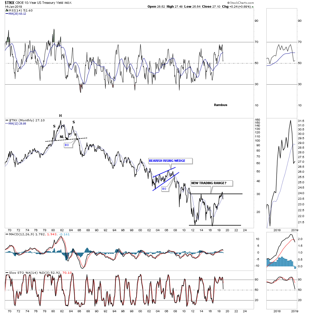
This shorter term weekly chart for the $TNX shows the last rally phase forming a large six point bearish rising wedge which broke down in late November of 2018. Normally a rising wedge like this will have a price objective down to the bottom of the rising wedge where it began to buildout which would mean interest rates may test their previous low made in 2013 and 2016 as shown by the long term monthly line chart above. Something to keep an eye on.
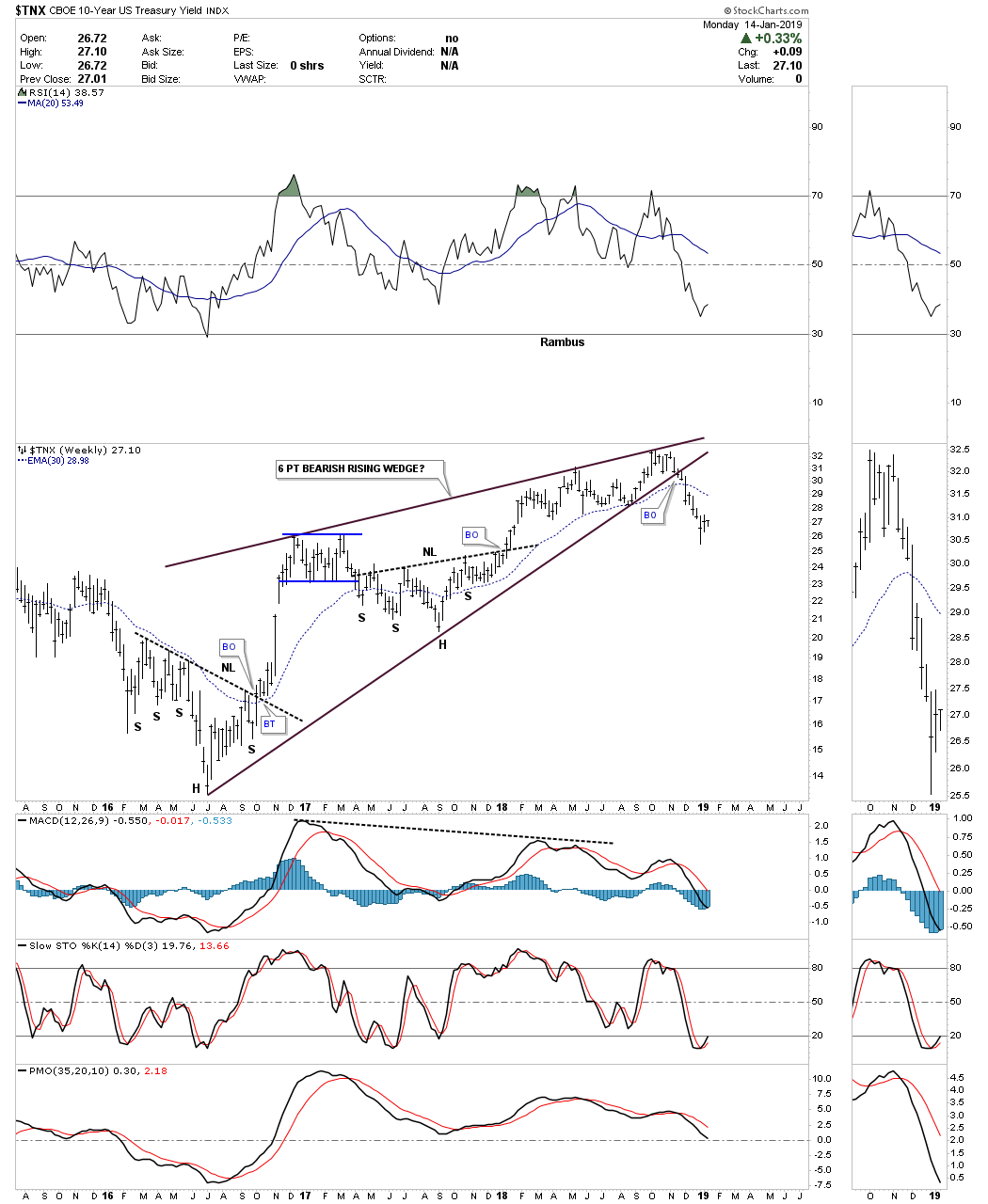
Below is a long term 45 year monthly combo chart which has the $TYX, 30 year yield on top and the $TNX, 10 year yield on the bottom. In October of 2018 it looked like both the 10 and 30 year yields were going to finally breakout above the top rail of their 37 year long downtrend channel. At the time it looked like both were forming double bottoms with each one trying to breakout above their top horizontal double bottom trendline, but were stopped once again by the top rail of that 37 year downtrend channel. With each experiencing a false breakout and with the bearish rising wedge we looked at earlier on the $TNX the odds look high that both the $TNX and the $TYX are likely to decline back down to their previous 2013 and 2016 lows.
We have been following most of these long term monthly charts with their 12 month simple moving average for several years. Last quarter we began to see a few cracks start to develop in a few charts. This 4th quarter update now shows many of these long term monthly charts breaking below their 12 month sma. It’s not the end of the world, but it does show these markets are under pressure.
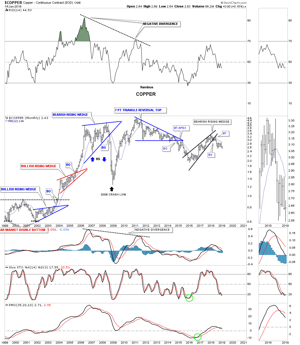
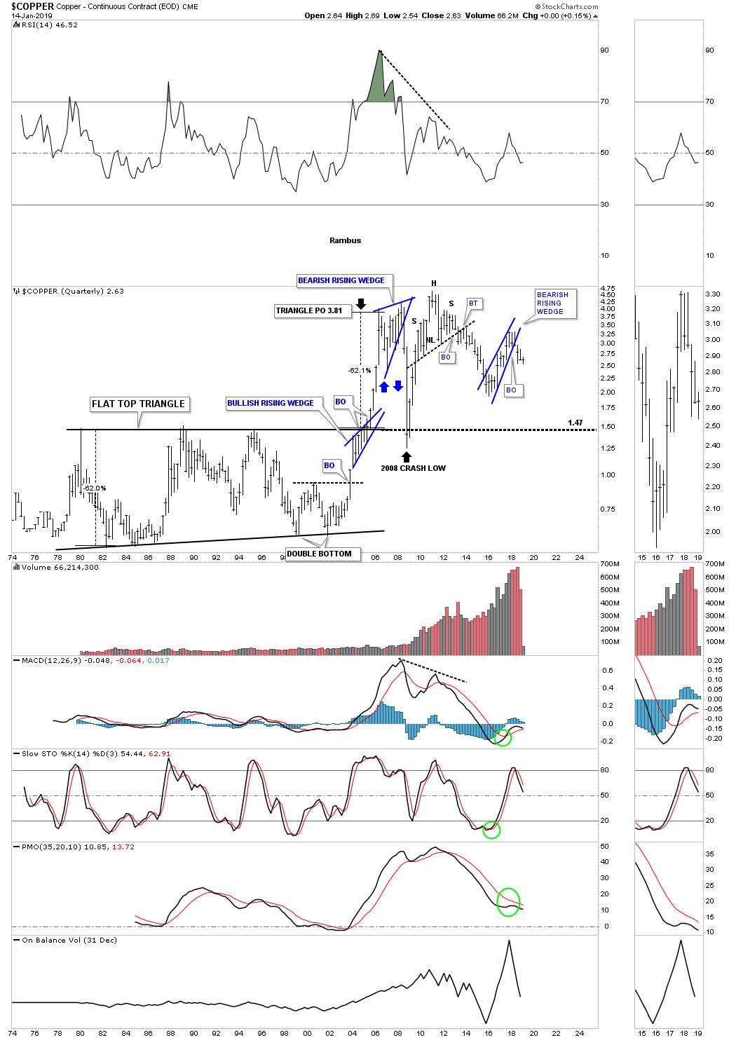
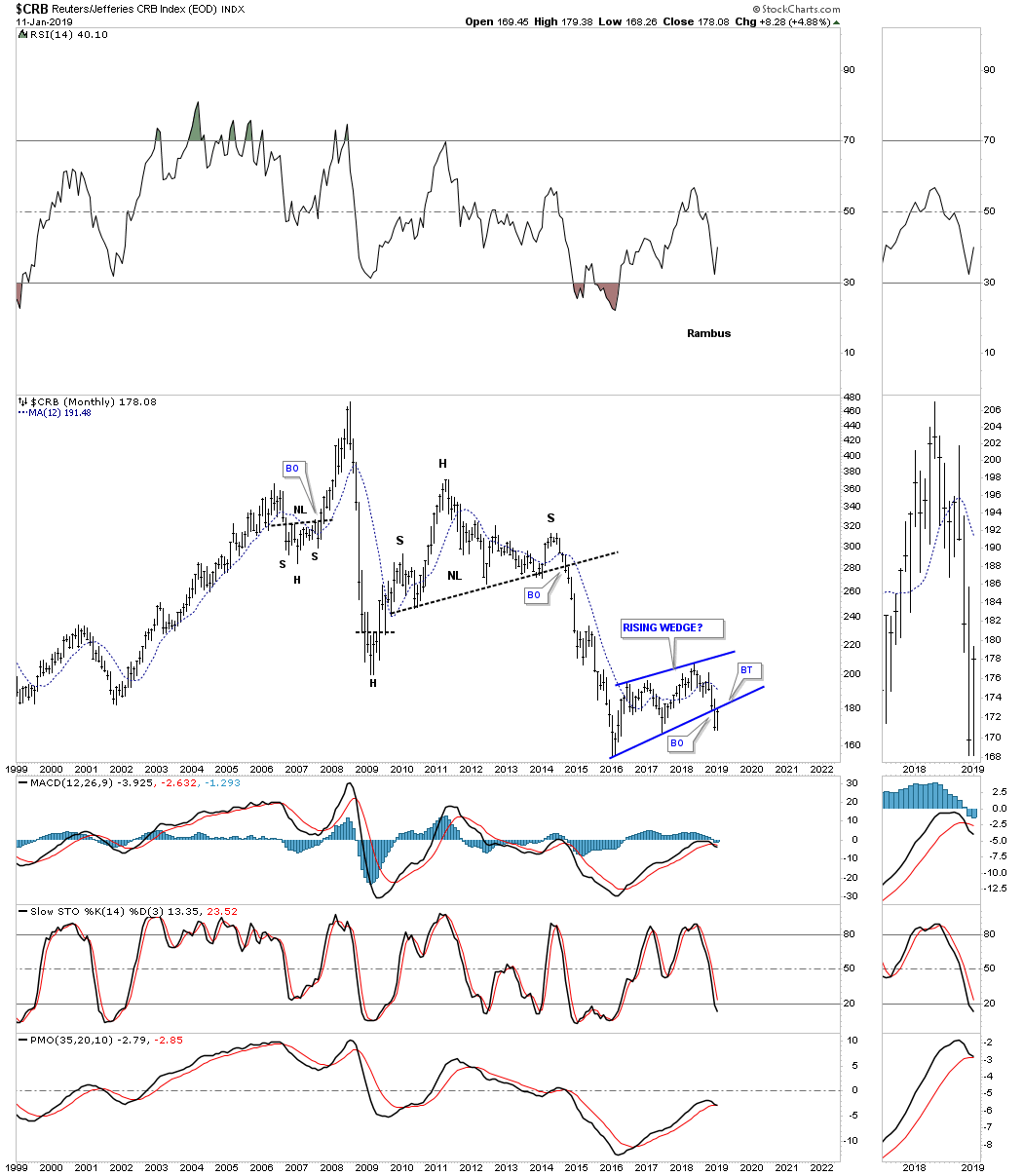
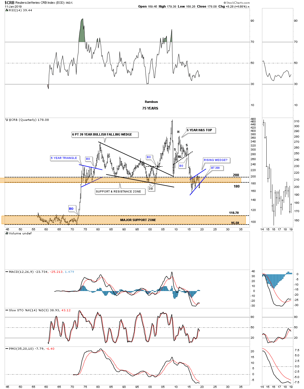
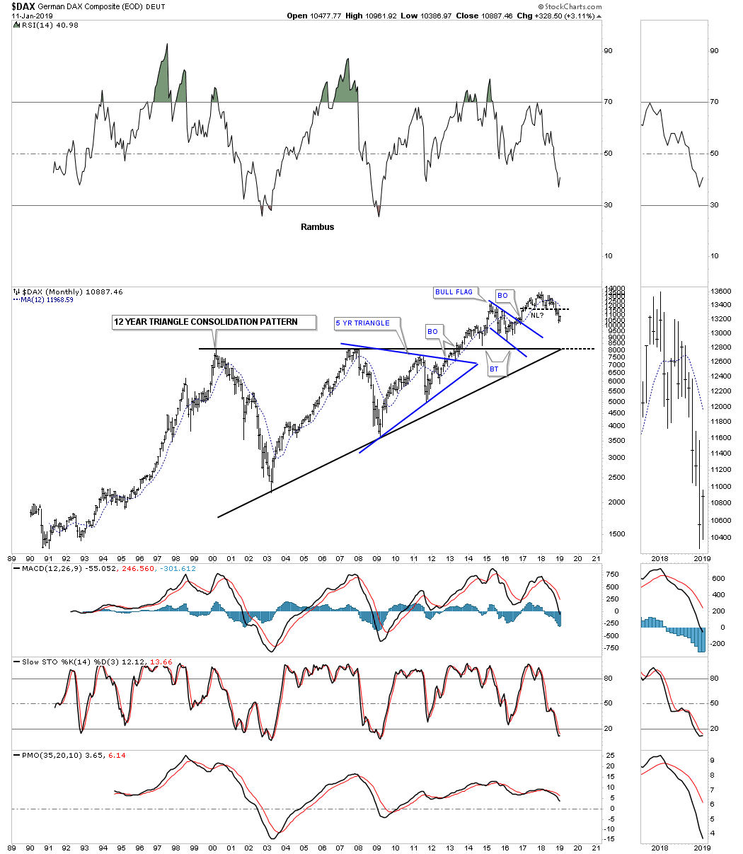
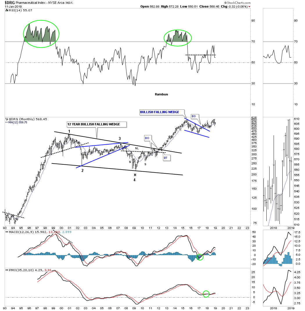
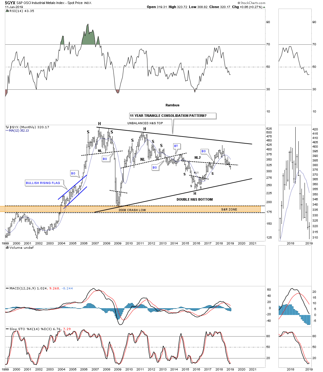
When looking at the variety of stocks from many different areas of the markets including some commodity related indexes, make sure you look at the 12 month sma and how the price action is interacting with it. Normally during a strong impulse move, either up or down, the 12 month sma does a good job of hold support or resistance depending on the direction of the move. The quarterly charts for $COPPER, $CRB and the $WTIC are showing some interesting price action.
$AORDS
$BKX

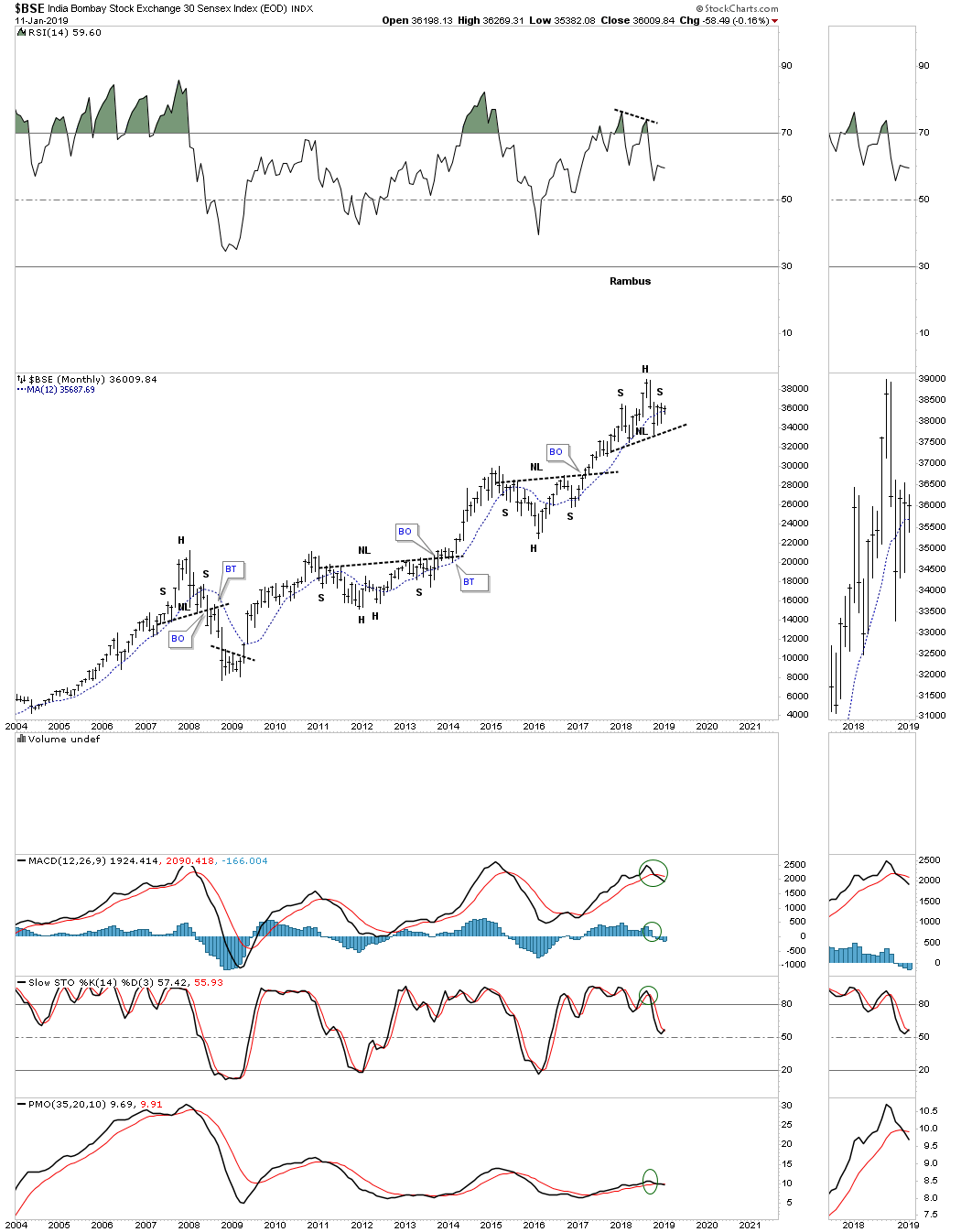
$BSE
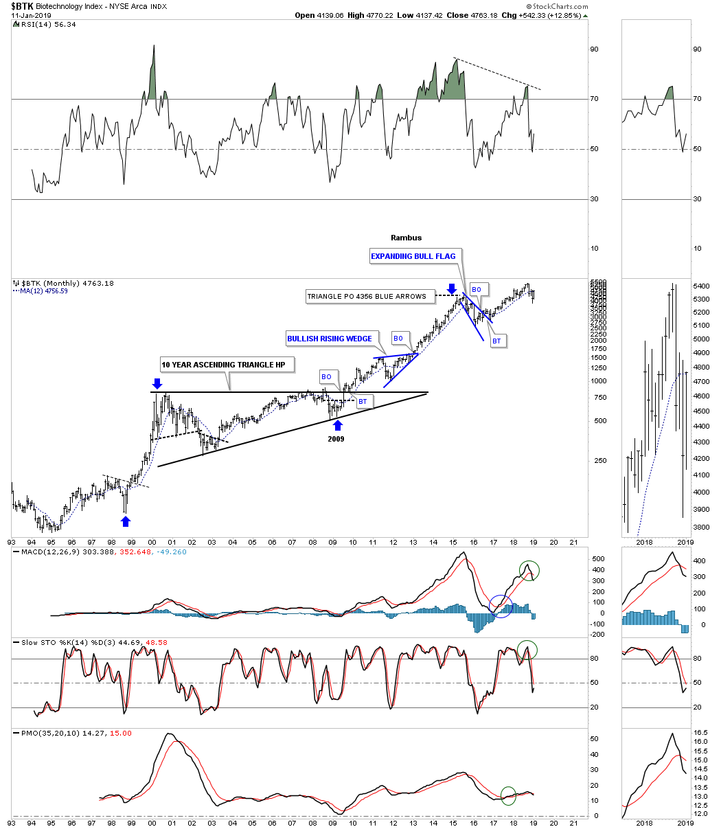
$BTK
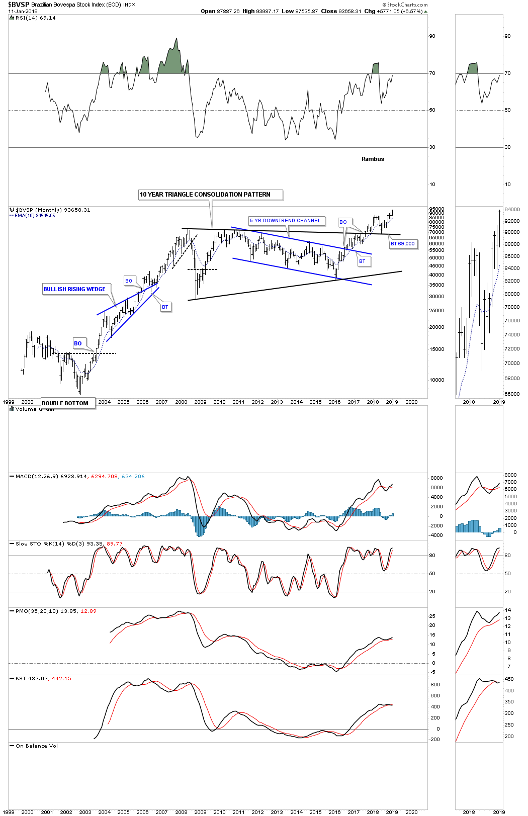
$BVSP
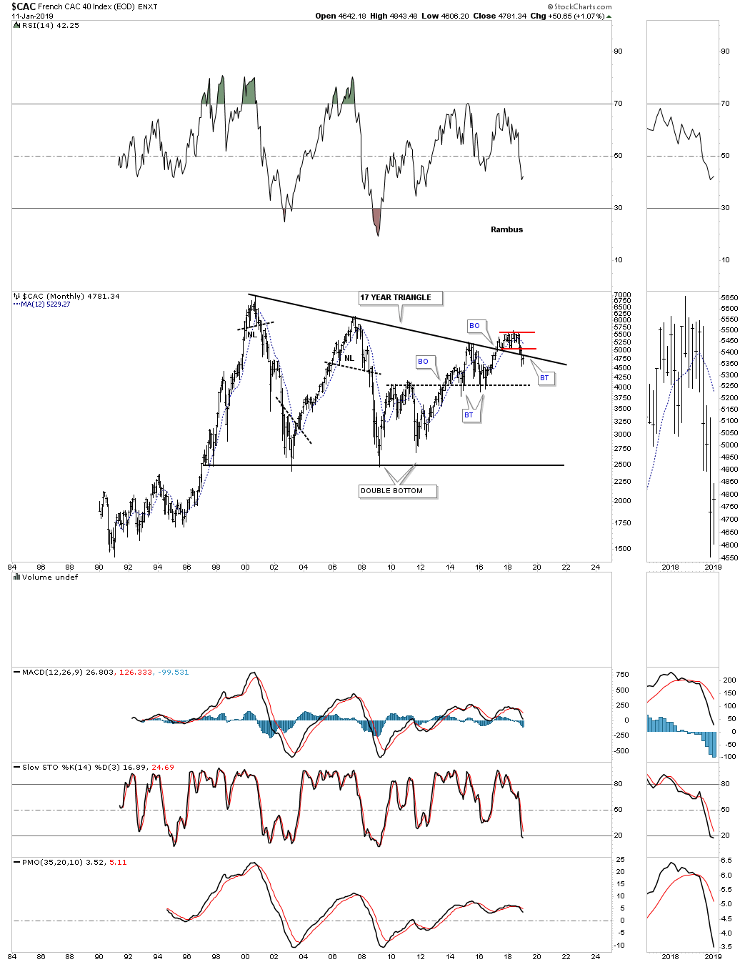
$CAC
$COMPQ
$COPPER
COPPER QUARTERLY
$CRB
$CRB QUARTERLY
$DAX
$DRG
$GNX

$GYX
$HGX

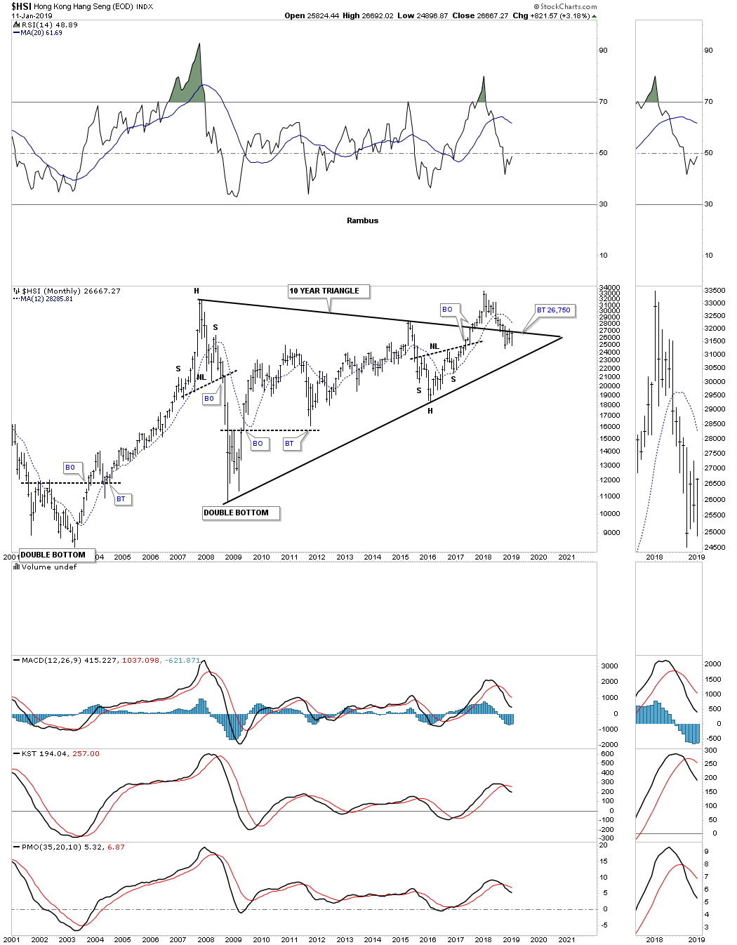
$HSI
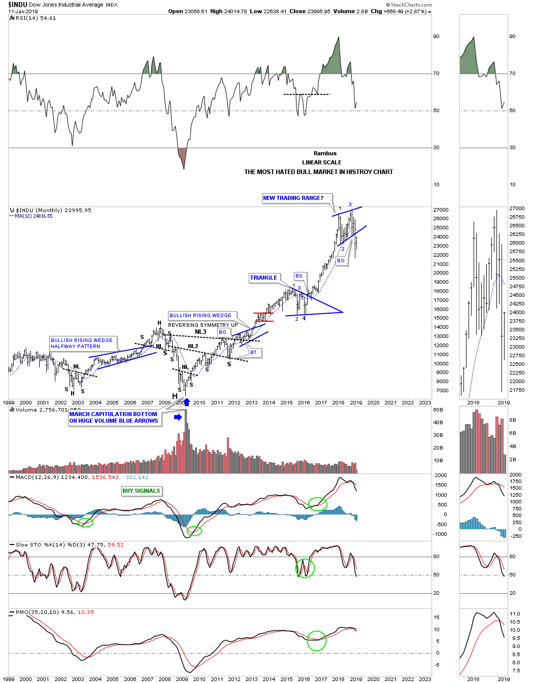
$INDU
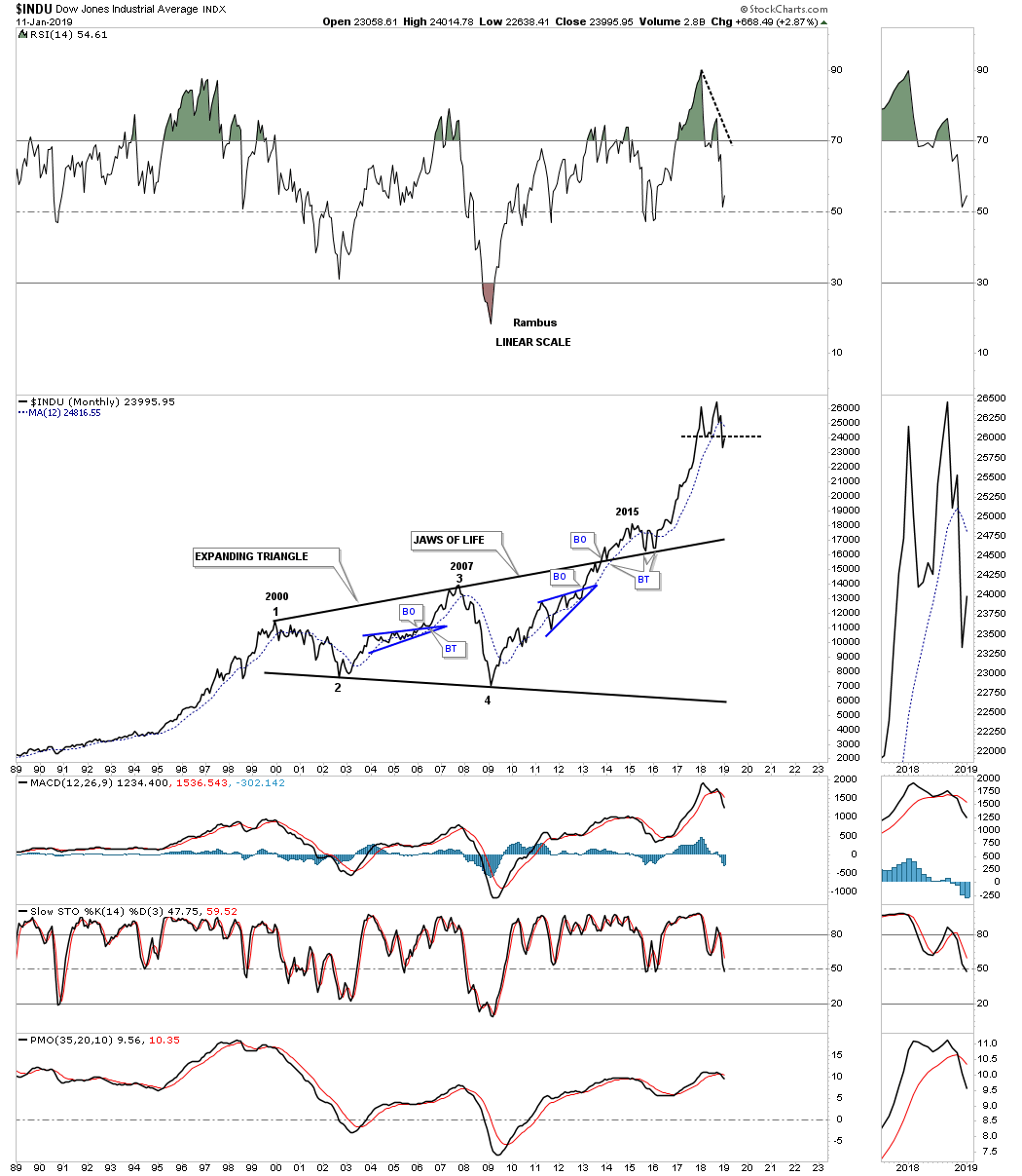
$INDU JAWS OF LIFE
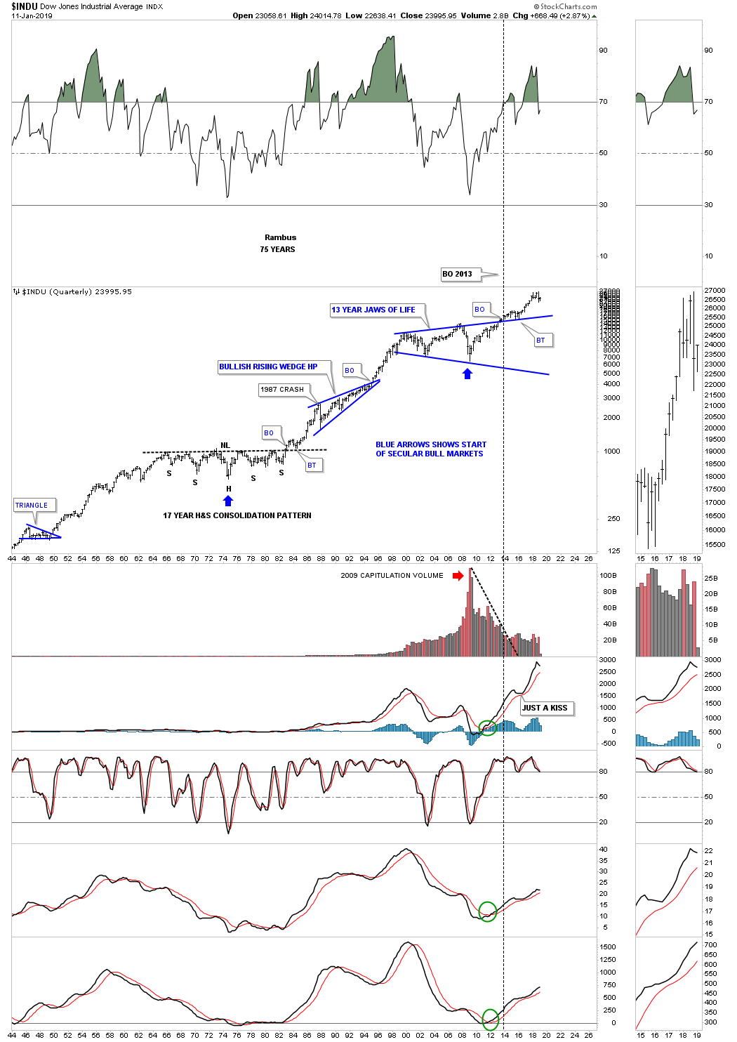
$INDU 75 YEARS
$NDX

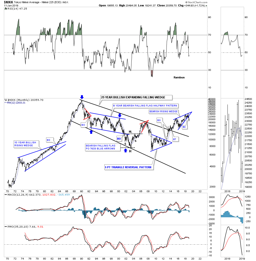
$NIKK
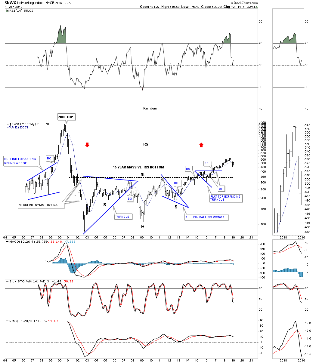
$NWX
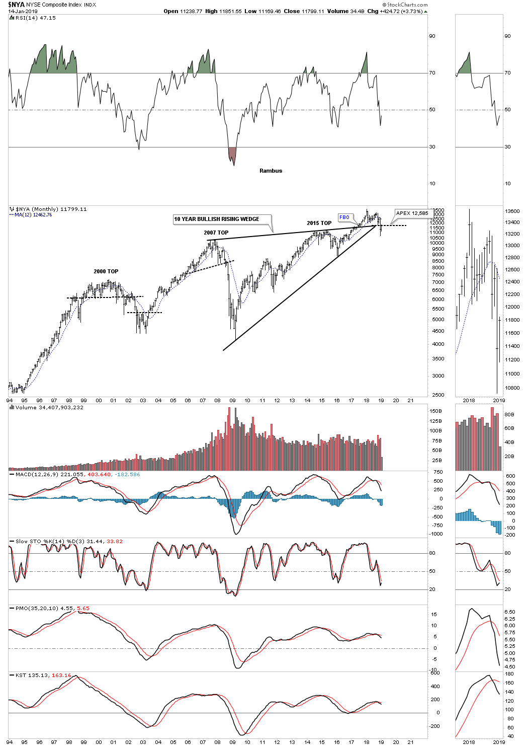
$NYA
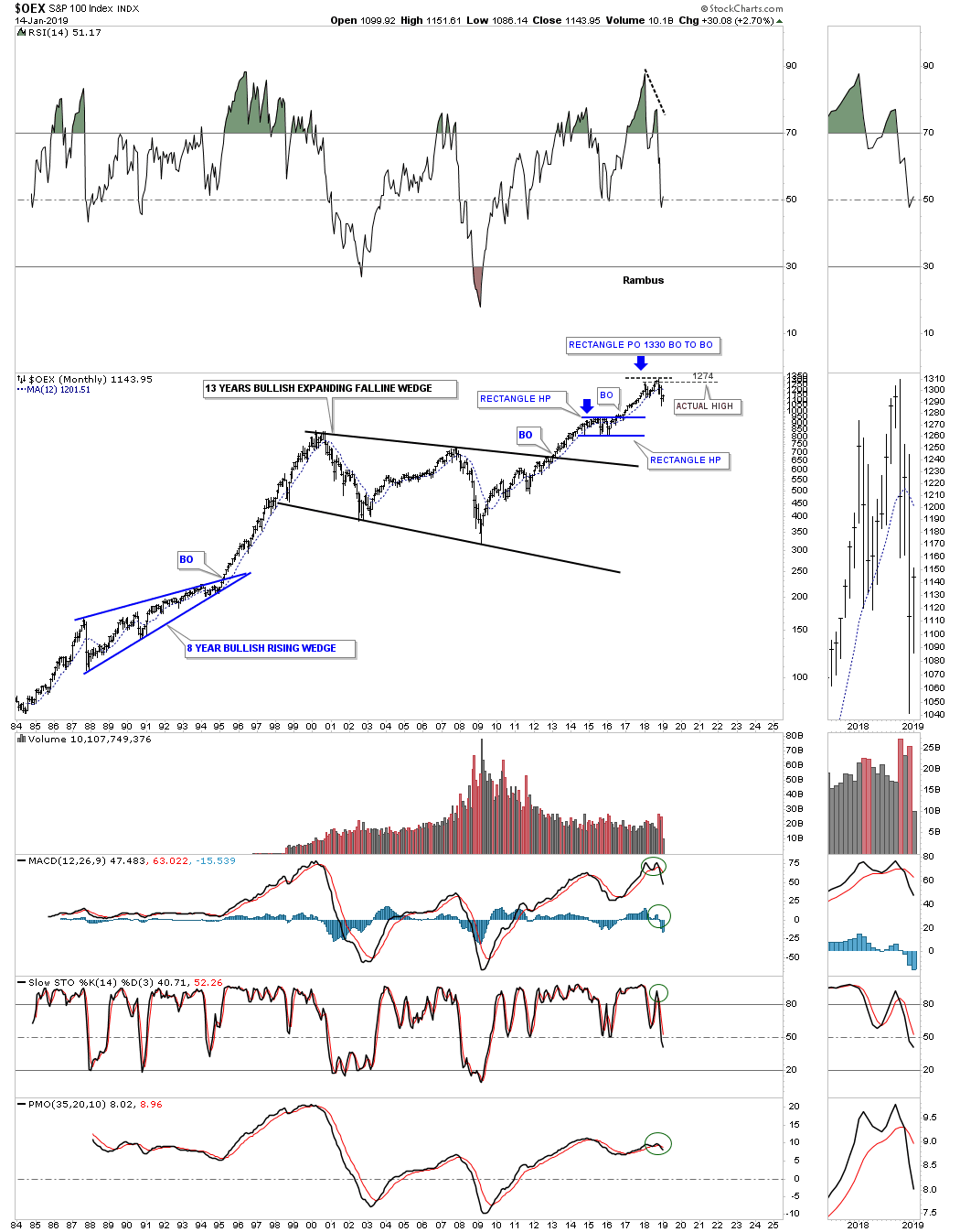
$OEX
$RUT
$SOX
$SPX
SSEC
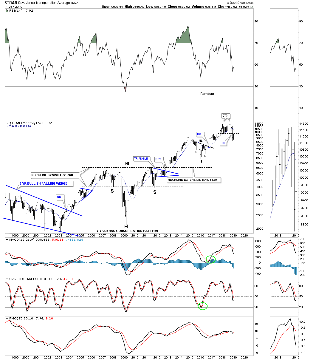
$TRANSPORTATION AVERAGE
WTIC
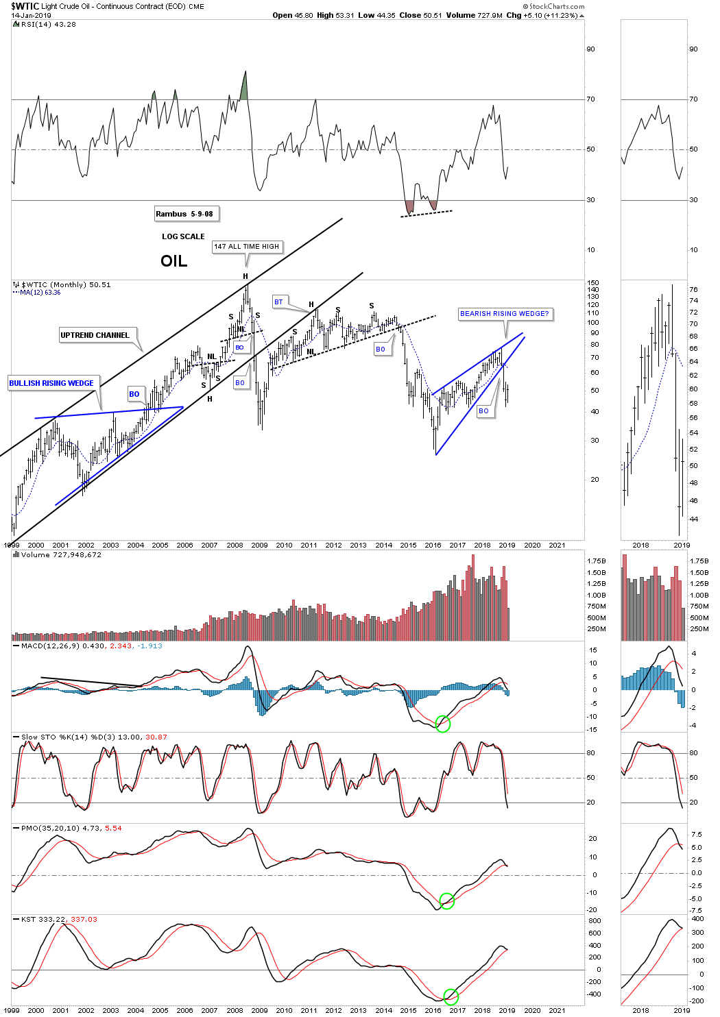
WTIC QUARTERLY

Weekend Report – Mr. Bear Bides His Time
By Plunger
Plunger is a featured writer at Rambus Chartology
In this report we will explore where the markets are in their current phases of development. The driving force powering markets remains the post bubble contraction (PBC). The public has been unable to grasp this immense force which has been busy reversing decades long trends over the past year. We will delve into the implications of these trend shifts over the long term and then determine just where markets fit within the bull and bear market continuum.
In part one we review the FED’s role in the process and describe where the overall stock market now stands. Later in part two, we will see how the precious metals sector has now likely turned the corner and is resuming the upward trend it started in 2016. Hopefully I can get you to peer over the horizon, past the short term noise, to see the vast stretches of territory markets are about to embark on both to the upside and down side.
Part 1- The Market and the FED- We now have seen enough to know.
In the last report I described how markets have become addicted to free and easy money over the past 30 years due to the FED’s policy of credit expansion. The market’s money addiction is no different to how a drug addict behaves once he is addicted to drugs. Any observer of the FED’s recent flip flops must now realize that the FED is hopelessly held captive by the markets addiction and its monetary withdrawal symptoms.
In October the Fed attempted to wean the market off of easy money by removing the word “patient” from its statement. Things didn’t go well. Then in early December after Powell indicated the FED would NOT be flexible, the market realized it was going to have to go cold turkey and went into a convulsion. Since then the FED has delivered an unending series of flip flops attempting to settle the market. In short, we just witnessed a full blown FED capitulation to the markets demands, a cave-a-thon, and it’s driving stocks higher for now. Through their actions it is now clear that they are being held hostage by the market. That sure didn’t take long!
The significance of all of this is that it confirms Mises was right:
There is no means of avoiding the final collapse of a boom brought about by credit expansion. The alternative is only whether the crisis should come sooner as the result of voluntary abandonment of further credit expansion, or later as a final and total catastrophe of the currency system involved.”– Mises
So I have titled this segment “We now have seen enough to know”.
What we now know is that Mises was right, the FED will not abandon the credit expansion, they may give lip service to attempting to rein it in, but the markets have now made it very clear, it cannot survive without its cheap money and its going to get it.
Enter the resumption of the bull market in gold and precious metals.
Just because the market has now demonstrated that it has the FED wrapped around its finger it doesn’t mean the market will now resume an indefinite uptrend. No, it’s just like our addict which continues to get his drugs, he now embarks on his downward spiral until he eventually hits bottom. So that is where we are, so let’s take a look at the bear market ahead and get an idea of how it may unfold.
The world’s stock markets are now firmly entrenched in a bear market:
Stock Market Returns over a bear market cycle
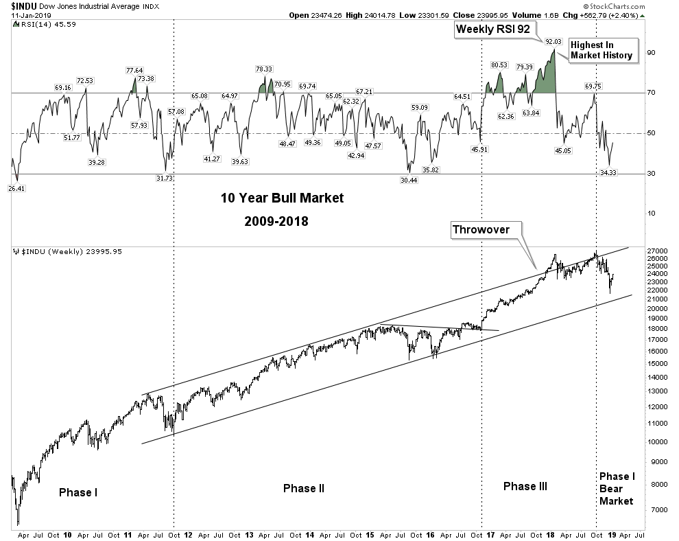
Most of us know that market valuations have no relevance to short or medium term stock market performance. Market liquidity is the primary determinant in these periods. However, over the length of a market cycle of 10-12 years valuation is the principle determinant to stock market returns. I implore you to grasp this concept because it means that if this market returns to average bear market valuations, the market will decline 60%. That is an S&P 500 price objective of 1192. This level requires only a run-of-the-mill cycle completion. If valuations overshot to the downside it is conceivable that the S&P could visit sub-1,000. It is my judgement that the US stock market has now entered into a secular bear market. This long term downtrend could encompass several cyclical bear and bull markets over a duration of 10-20 years within the overall context of a longterm downtrend. This insight is based on the record high RSI readings combined with record valuation levels registered at the end of the Phase III bull market blow-off witnessed in January 2018. This is the signature indicator forecasting an entry into a secular bear market. Once a valid Dow Theory Bear Market signal was given, as we witnessed on December 14th (first in 11 years), the trap door flung open and the bear was unleashed.
The last secular bear market began 53 years ago in 1966 and lasted 16 years until 1982. Previous to this the 1929 secular bear began 37 years before and lasted for 19 years. Going further back, the timespan separating the secular bear market prior to 1929 is 56 years beginning in 1873. This secular bear market lasted 21 years. So one can see from a historical timeline our present 53 year hiatus is an extended interval which often results in a deeper than normal contraction.
Phase I Bear Market
On December 14th the trap door was flung open and the bear then had its first romp to the downside. He is a sneaky fellow and used the thinly traded session on Christmas Eve to do the most initial damage. In the chart below we see the process a market must go through to achieve a bear market signal. At the beginning of 2018 it began this process, but ultimately it was not fulfilled since the Transports did not close below the secondary reaction lows. The Dow then went onto higher highs peaking on October 3rd 2018.
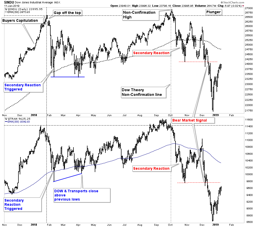
On December 14th however, previous secondary reaction lows were both violated on a closing basis which triggered a bear market signal. This bear market signal came after the market had declined 11% highlighting the worthlessness of today’s conventional “definition” of a bear market beginning at -20%. Dow Theory bear market signals are only valid when they occur in Phase III. The market entered into Phase III the morning after the election of Donald Trump and it lasted for 23 months, an exceptionally long period on a historical comparison.
DOW Principle: Once a bear market is triggered it will continue until it has fully discounted declining business conditions to come and completed the amount of healing an economy requires to resume its advance.
It is typical for a full bear market to progress through three complete phases. Today’s market is presently entrenched solidly in phase I. Phase I is when investors abandon the euphoric expectations of unrealistically high stock prices. Stocks then sell minus the frothy “hopes and expectations” of the previous final boom phase. Clearly one can recognize this is precisely what is occurring today. Later on in Phase II stocks will begin to discount declining business conditions, but we are not there yet.
Previous market sell offs compared to today
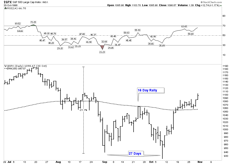
Let’s look at some previous declines and how they stack up to the current market. First the LTCM sell off in 1998. Here we had a very similar 21% sell off followed by a 16 day rally. It then retested the previous low taking a total of 27 trading days.
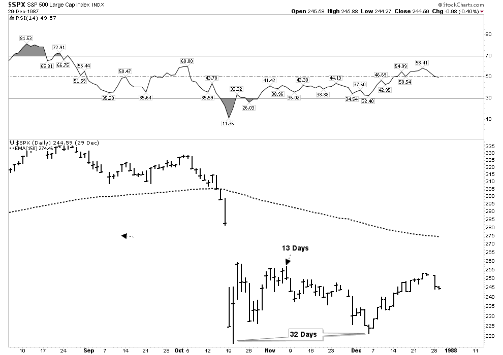
1987 Crash. Here we had much more extreme moves however we see a 13 day bounce followed by a total of 32 days until the retest.
2008 initial bottom with a 17 day bounce followed with a 30 day retest.
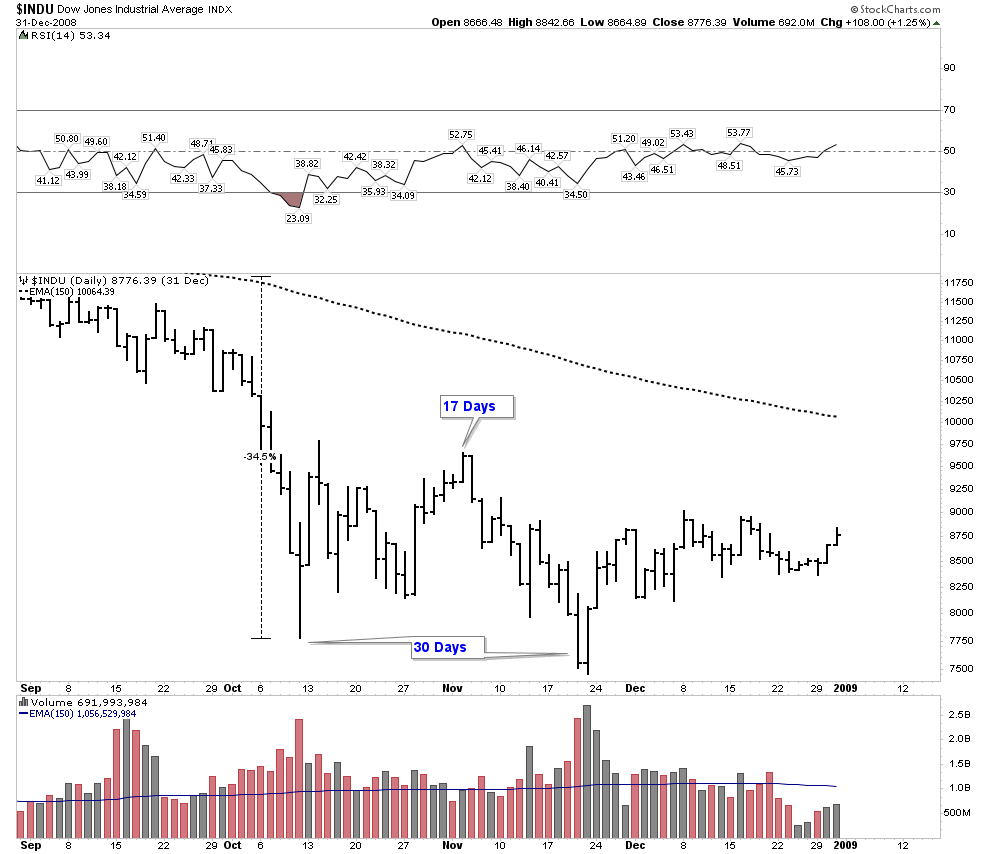
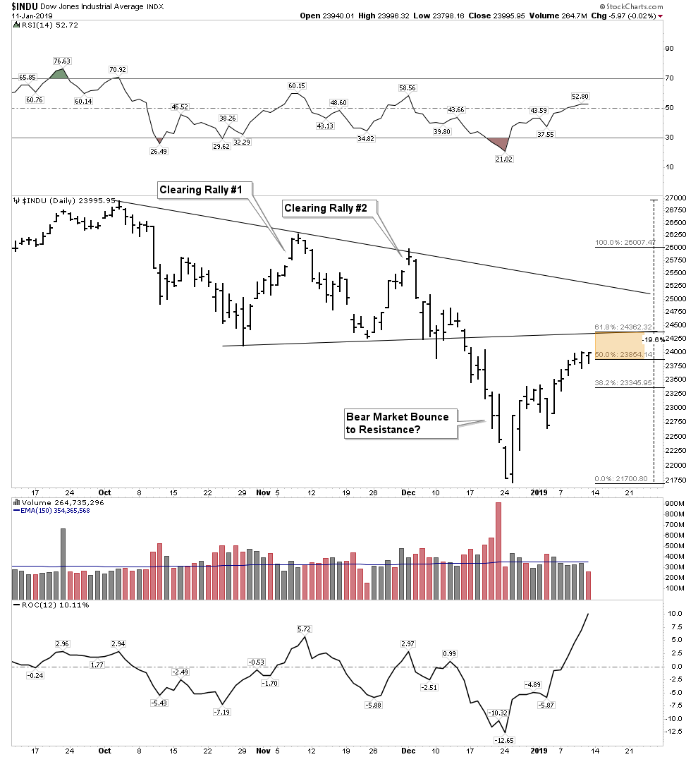
Today’s market shows us 12 days into a bounce retracement. Previous examples ended at 13,16, &17 days. I drew a vertical line at 16 days as a reference. Furthermore, if one was to use an Elliott 5 wave rally I numbered the advance in blue. Note heavy resistance comes in at the base of the triangle to include upside extremes in fib retracements.
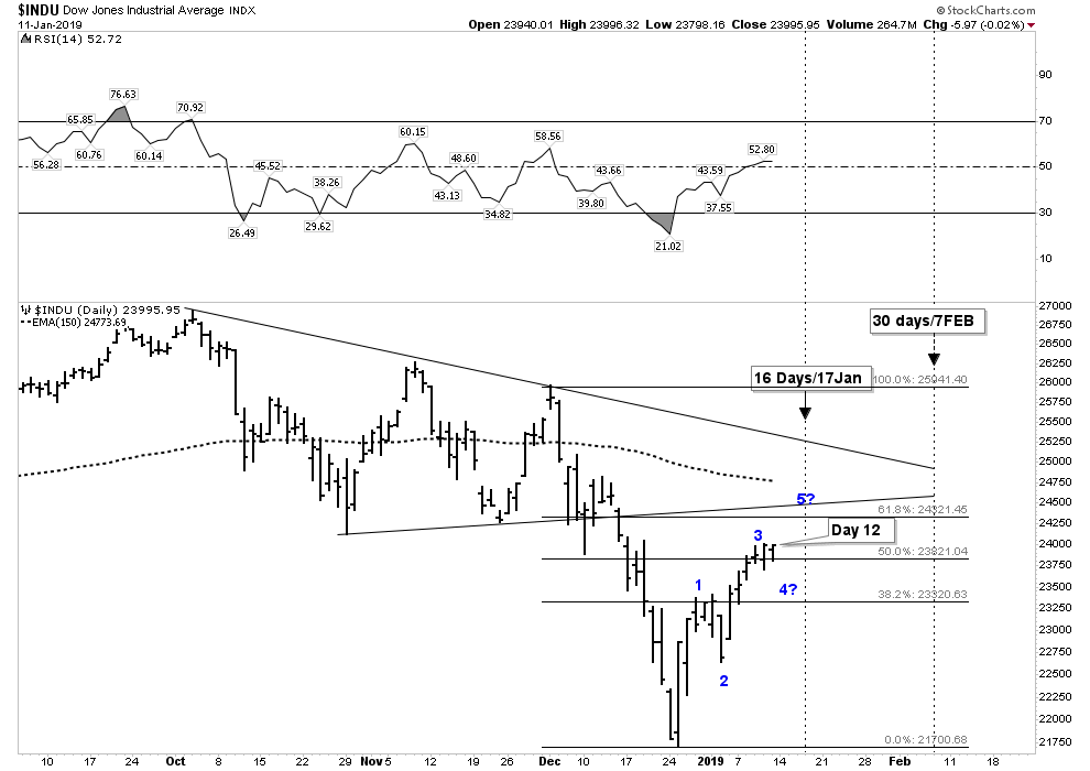
So if this bounce resembles past experiences we could see a top put in mid next week, with a bottom retest in the vicinity of Feb 7th. This is all guess work based on past examples. My favored outcome would see a lower low shake out in early Feb, then the market puts on a more prolonged 2-3 month secondary reaction to the upside which would restore hope that the worst is over and the bull has resumed. The failure of such a rally would introduce phase II of the bear market. In total, I would look for the entire bear market sequence to last from 2-3 years.
I favor the immediate lower low outcome since we have never witnessed panic selling to this point. There has never been a clean out where traders panicked on a short term basis. Instead, what we have seen so far is orderly selling. If you want to see what a clean out looks like we saw one last February in the panic sell off. Notice below how down vs up volume blew out to the upside.
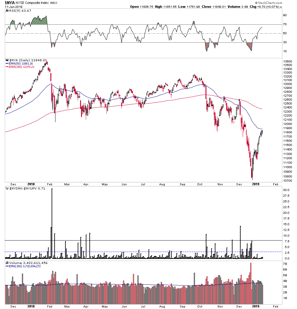
Yes volume surged the day before Christmas Eve, but it remained orderly.
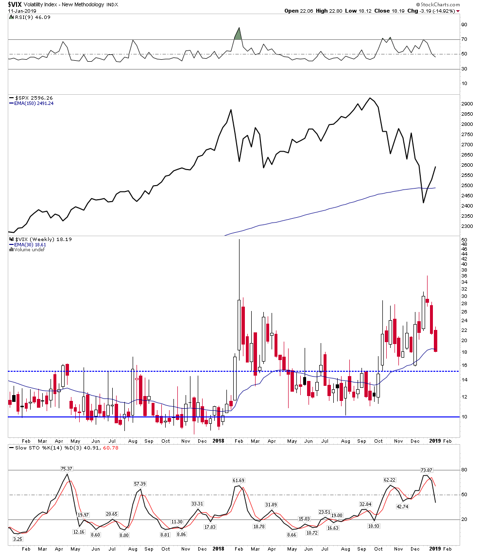
Let’s also look at the VIX. Again, we see it as elevated but not reaching the levels of panic as we saw in February:
Thoughts on Bear Market Strategy
When I go to work I always make it a point to speak with my workmates about the markets. In the command position I am in the reality is that I control the conversation, therefore I try to be light handed. My objective is I want to feel out the perspective others have as it helps me judge the psychology of the market. All stocks have an owner at all times so I know there is no point in converting anyone to my views. It does no good for me to convince someone to sell, since someone else will end up holding it anyway, but I like to know what others are thinking. I work with typically mid-40’s to mid 50’s men (some women) who have disposable income to invest and all have active fully funded 401k’s. It absolutely amazes me to see how little knowledge of financial markets exists among otherwise educated people who are old enough to know better. Virtually all of these people will experience the crushing destruction of a secular bear market. It is coming straight down the tracks right at them and they have no clue. Instead, they have fully bought into the line spun by Wall Street that one should stay invested at all times. They have no knowledge of history, no idea as to what now lies in store, and no amount of sound reasoning will convince them otherwise. No, what they need and what they will get is an object lesson in bear market pain.
So here is my plan on dealing with market realities. We are now in a bear market!…Deal with it! That’s not a bad thing, it’s actually a good thing because the excesses which created this reality are now going to get corrected… hallelujah! Once it is over we can then grow again. But before we get there, investors and the country are going to suffer a lot of pain.
But keep in mind fortunes can be made in bear markets. Joe Kennedy made the bulk of his fortune from the bear market of 1929-1932. It gave him the resources to buy the Chicago Merchandise Mart at rock bottom prices which funded his fortune for the rest of his life. The wealthiest man in the world, Paul Getty established his foundation for future wealth accumulation by buying oil rich stocks with both hands right at the bottom of the bear market in 1932. He later went on to buy the Pierre Hotel in Manhattan at the rock bottom of the Real estate market in 1938 for a miserly $2.5 million dollars. It is NYC’s finest hotel today valued well in excess of $1 Billion.
There is nothing un-patriotic about shorting stocks. In fact, it’s downright patriotic to be solvent at the bottom and buying sound assets. The country actually depends on you to do it. So now is the time to do a total mental conversion. I am out of the bull market of the past and into the new bull market of the future. I don’t hold stocks in the general market for the long term anymore, I trade them instead. Instead of buying the dip, I now sell the rallies. That’s the mental conversion…it’s time to get with the new regime.
If you are still invested in the regular stock market it’s never too late to do the right thing. To be successful you will need courage. Courage to short and courage to buy at the bottom. You will have to focus on eliminating your need to be part of a group. You will have to rely on your intuition. It’s hard to make money in a bear market, contrast that to how easy it is to be part of the crowd and lose money. CNBC is telling investors what they want to hear, you are going to have to be an independent operator, able to make your own decisions against the crowd.
Part II- The New Bull Market
Be Right-Sit Tight
As we have stated before, just like it’s always 5 O’clock somewhere there is always a bull market somewhere. So I would like to make a case that the precious metals and uranium are indeed in the early stages of a multi year bull market. This theme fit’s right in with the PBC sequence. Diago Parilla has described the phenomenon that where there are bubbles there are also anti-bubbles. This is because the formation of bubbles causes anti-bubbles by drawing money away from these assets. Radical central bank crack -pot policies have led to the formation of the everything bubble. Anything that rests on a foundation of credit has been bubbled since 1971 with the end of Bretton Woods #1. Gold has since become the ultimate anti-bubble, the mirror image of bubbled assets. The huge build up of unserviceable credit will ultimately lead to a devaluation of currencies which will unleash the anti-bubble gold.
The fuse has now been lit, it will take some time, but the process has begun. It will be manifested in a bull market in the precious metals. This is a slow moving process at first and on a day to day, week to week basis it is typically imperceivable so it’s easy not to see the trend. For the past 8 years the gold market seems to either only go down or at best sideways. But gold has simply been in a huge consolidation:
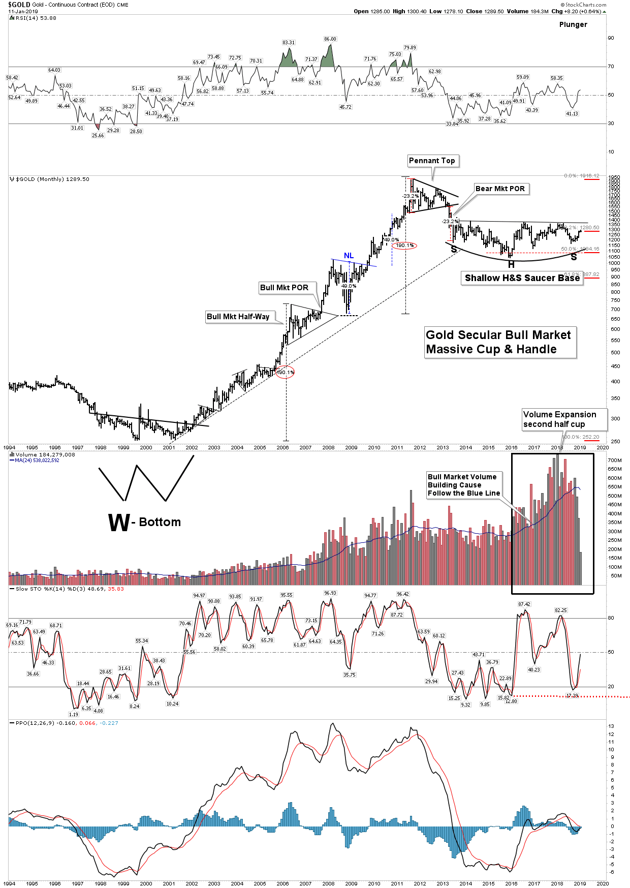
Over the past 8 years gold has been consolidating the massive move up which began in 2001. It had a 50% fib retracement of those gains which incidentally is the same amount as it retraced in the middle of the 1970’s after its first leg up in its 12 year bull market. It now appears it is nearing an end to this consolidation with its 5-year saucer shaped inverted H&S base it has built out.
Markets don’t always give us clean-cut patterns to hang our hat on. With this in mind let’s compare today’s 5-year bottoming process with the bottom of 1999-2001. This previous bottom built the base for the massive 10 year, 7.5X move in gold and 1600% move up in gold stocks.
Today most investors remain very skeptical that gold has begun a new uptrend. It has been a bumpy road, but bumps are the norm in the early stages of an uptrend. Back in 2000 the general stock market was ending a 10 year bull market which had developed into a mania bubble. As the market was undergoing its blow off top, gold bottomed in September 1999 and then underwent a 27% surge off the low due to European central banks temporarily ending their gold sales. This obviously lit a fire under the gold market, however the rally fizzled over the next 19 months totally demoralizing any new gold bulls. After a 20 year secular bear market it quickly came to be viewed as just another cyclical spike to be followed by lower lows. All players were crushed…again. Large speculators built up their short gold positions over those 19 months. Commercials, however built out huge long positions. These commercials remained “wrong” for well over a year as gold deflated prior to turning up.
So in this episode gold rallied 27% and gave it all back profoundly discouraging any reluctant bulls, but if one sold he missed the most glorious bull market likely in his lifetime.
Fast forward to today… in 2016 gold rallied nearly 30% just like in 1999 and then proceeded to fizzle over the next 2 years. But it didn’t give it all back…far from it. The stocks have been mixed, some grudgingly gave back some gains while others particularly the juniors and the silvers gave most of their gains back. But investor whining and demoralization seems epic. Skepticism is total, even though we have a repeat of the commercials being huge long and the speculators being huge short. Patience was required in 2000 and I submit patience is required today.
Actually, the fundamentals for a higher gold price are far more favorable today then it was 20 years ago. Central banks are buying gold today, whereas 20 years ago they were selling. Debt levels are far beyond sustainable today whereas then they were manageable back in 2000.
Let’s take a closer look at today’s bottoming action in the gold market:
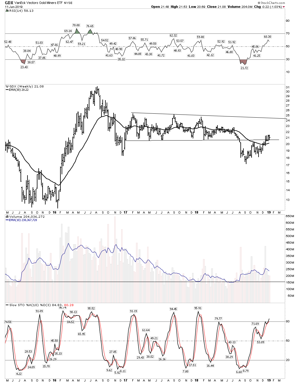
After a brutal 5 year bear market where the majors lost 80% of their value the GDX exploded upward over a 7 month period in the beginning of 2016. As we all know prices fizzled out and seemed to resume the bear market. For the most part it has been a painful experience since August 2016, especially considering the FAANGs went ballistic and you were left watching. I personally continued to classify the action in the PM market as still in a bull market beginning in Jan 2016, but I was a lonely voice. Prices finally reached a low 25 months later in September 2018.
So let’s look at other examples of initial leg up consolidations:
In the 10 year bull market in oil the first leg up lasted 11 months going from $11 to $37, a huge run. Then over the next 13 months dropped down to $17. That was brutal.
Phase I zoomed in:

So here we see a 54% drawdown which totally blew through all fib retracement lines. A truly discouraging case for the bulls.
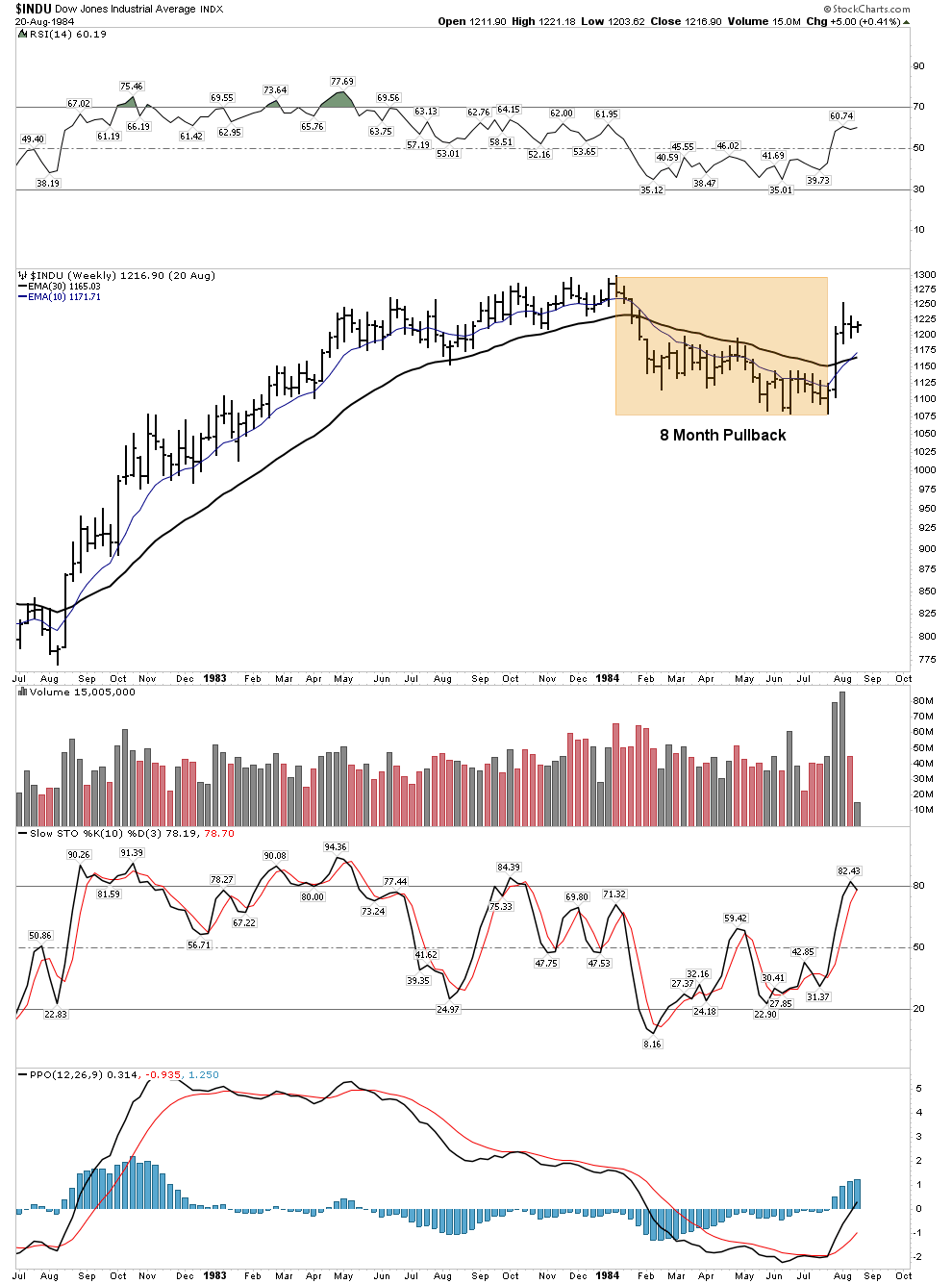
The DJIA August 1982. After the moonshot run which started the great bull market in 1982 the DOW entered into an 8 month pullback. Keep in mind that the DOW had just completed a 16 year secular bear market and it appeared as if the great rally was on its way to failure. Just another false hope in a trail of tears:
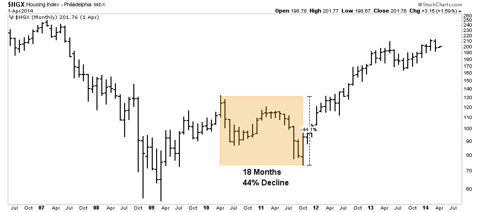
Housing Index after the 2008 crash had a one year initial leg up followed by an 18 month 44% decline before the bull resumed.
These types of drawn out retracement consolidations are par for the course, one must learn to keep the faith.
The Classic Retracement Bottom- Perfect Psychology
On 10 September 2018 the gold stocks put in their retracement bottom after a 25 month pullback process. As mentioned, this interval served to shake out the excessive enthusiasm developed in the 7 month vertical run of 2016.
The bottom in September was particularly brutal as it crashed down through a well developed and universally identified 2 year declining channel. This served to run all the stops and clean out all vestiges of bullish sentiment and positioning. Without question the sector was characterized by black pessimism.
On November 18th I titled the weekend report “Did We Just Witness The Bottom In The Gold Market?”. It became evident to me that we just had, as it seemed to meet all of the criteria which bottoms are made of. First and foremost was the fact that ALL expert opinion was universally bearish. I stated the following.
“A bottom occurs when virtually everyone turns bearish and thinks the drop has further to go.”
I had already begun buying large scale purchases, it was a very frightening thing for me. A few of my friends are prominent technicians and they were publicly advocating putting on hedges to protect against the next leg down. Needless to say I felt very lonely at the time. In such times one must marshal all his courage just to buy for his own account. Making public pronouncements from such a vulnerable lonely place is just too much to be able to do, hence I made the title of my report in the form of a question as opposed to a pronouncement. Now two months later it appears with each passing day that we in fact have seen the bottom. I still classify this infant bull as still in Phase I. It remains totally under the radar and will be in stealth mode until we can break through $1400 gold or say 200 in the HUI. But I believe the bull has now shown his hand and the number one challenge now is not to get thrown off.
Bull Market Phase I
We have already seen the first leg up in Phase I from Jan-Aug 2016. Even though that was a huge rally it still remained totally under the radar to the investing public, but the bull market had been born. The fact that the ensuing retracement has lasted 25 months serves to give us a clue to the vast upside that lies ahead. The public never plays a role at the bottom of a bear market since the public is unable to recognize bargains as they don’t look for value. In Phase I, stocks return to known values. We have not yet completed this process as gold stocks remain cheap. Once we return to known values the public will gradually begin becoming aware that the sector is in an uptrend.
Values in the PM sector still exist like a birds nest sitting on the ground waiting to be picked up. Royalty companies had a field day building out their portfolios during the brutal bear market years where operators had few options for available financing. Royalty companies will later be regarded as better than banks once the bull gets rolling.
The coming bull market will be a bull market in “real money”…honest money. The set-up is for a long term multi-cyclical bull that will not complete until the money system excesses have been righted. One can only speculate the form that will take, however consider a system which has been so totally discredited that it requires a form of gold backing in order for the FED to preserve its existence. This is what the massive bases in the gold charts may be telling us.
In future posts we will focus on constructing a reasoned portfolio to capture both the bull and bear markets.
Various Charts:
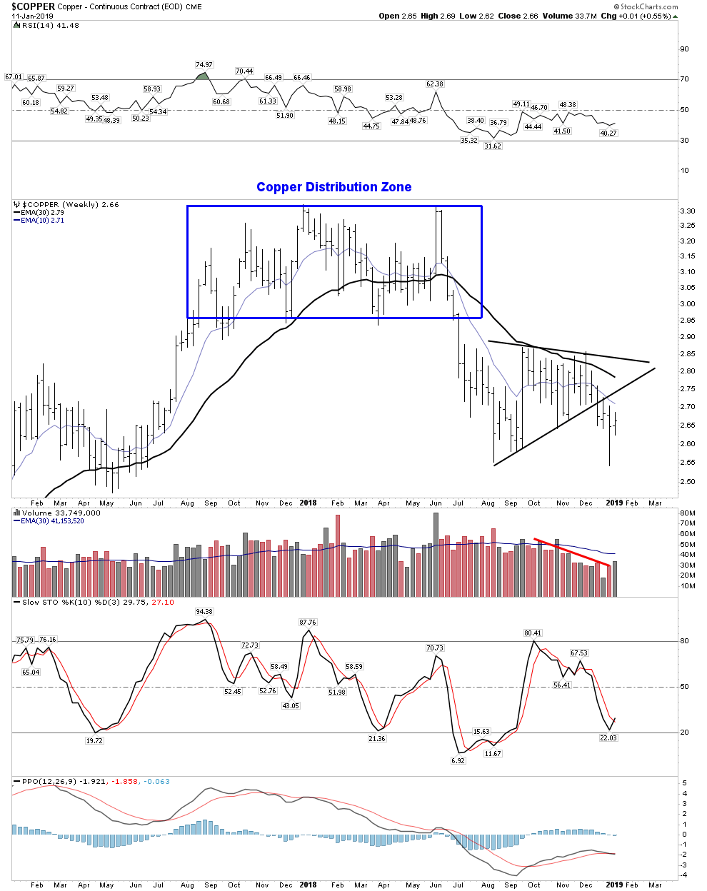
Dr. Copper says recession bound
10 year Bull Market is over– RIP
Dow Bounce to Resistance?
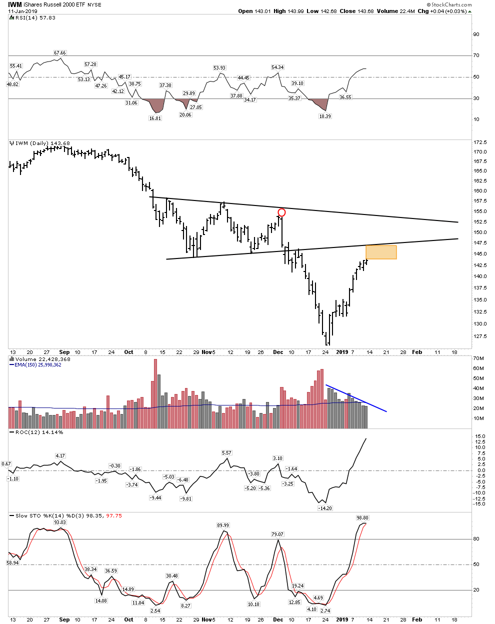
Small Caps:
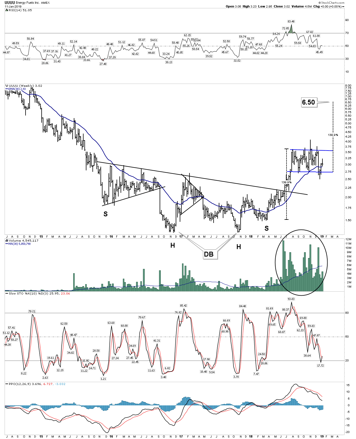
Energy Fuels Stochastics working their way down so as to cycle back up. Meanwhile price consolidates within an elevated channel.
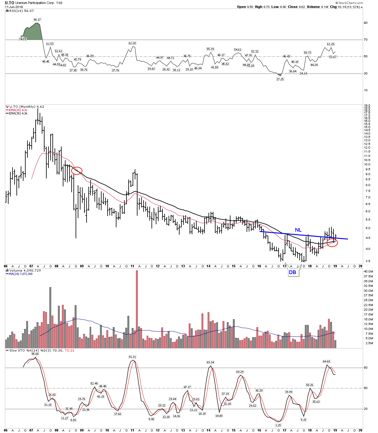
Uranium– Getting ready to put on a show?
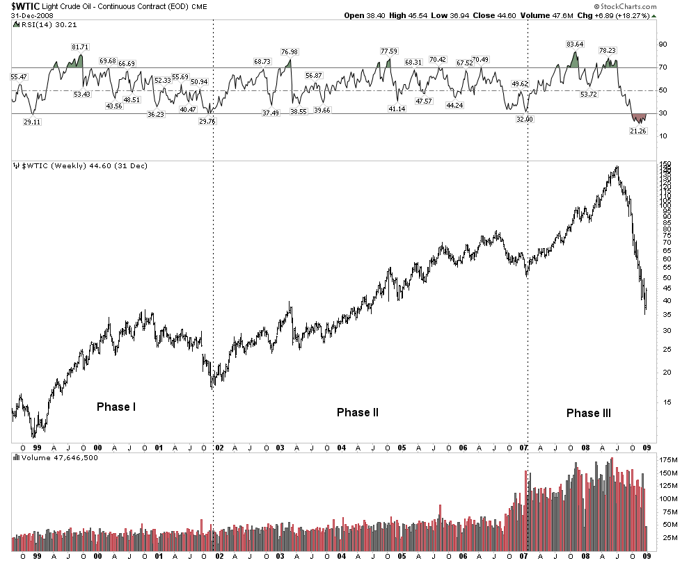
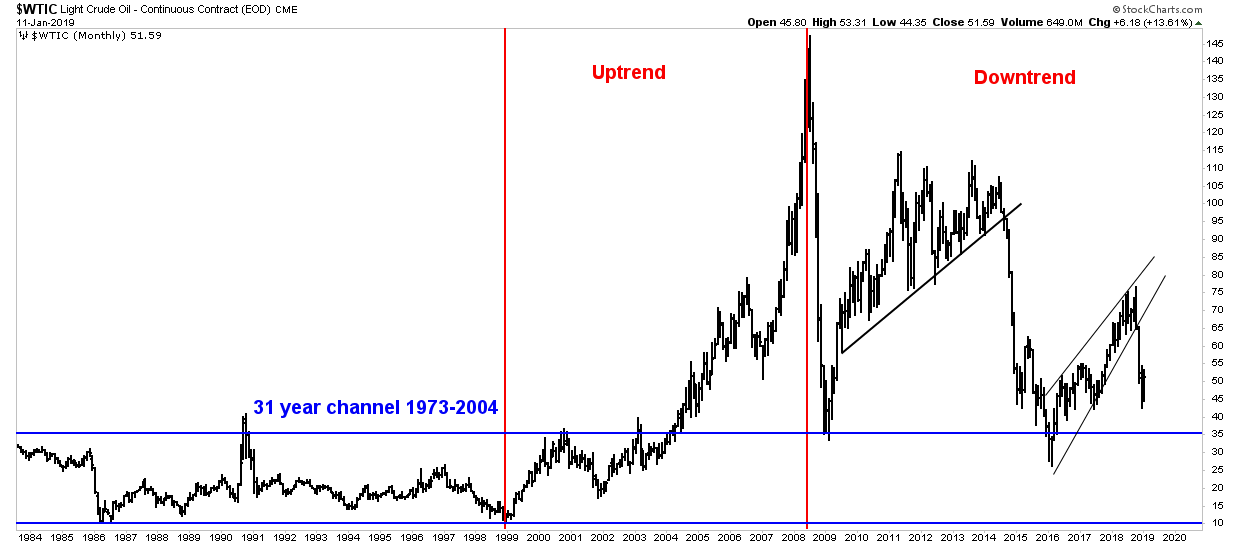
Oil- Continuing its secular bear market:
Related Reading:
- Rambus: Blockbuster Chartology – October, 2018
- Rambus: Blockbuster Chartology – July, 2018
- Rambus: Blockbuster Chartology – April, 2018
- 2017 Annual Wrap Up – Does Your Pension Fund Have A Deep State Drain? – January, 2018
- 1st Quarter Wrap Up 2018 Web Presentation
- Blockbuster Chartology with Rambus – October, 2017
- Blockbuster Chartology with Rambus – July, 2017
- Blockbuster Chartology with Rambus – May, 2017
- Blockbuster Chartology with Rambus – January, 2017
- Blockbuster Chartology with Rambus – October 20, 2016
- Blockbuster Chartology with Rambus – July 21, 2016
- Blockbuster Chartology with Rambus – April 21, 2016
- Rambus: Are We in a Deflationary Spiral? – January 28, 2016
- The Dollar, Gold & the S&P 500 with Rambus – October 15, 2015